Strengthen Your Data Culture to Get More Data Value
Transportation organizations are increasingly embracing the power of data-driven decision-making to plan projects and deploy precious resources more quickly and efficiently. As the transportation industry leverages new data collection and visualization methods, strengthening a data culture will ensure these teams find more insights, improve cross-functional relationships, and maximize cost-to-benefit ratios.
“Data culture” is the established set of principles of any organization that values and prioritizes the use of data as the foundation for all business decisions. It also includes the attitudes of stakeholders, including employees, administration, and constituents, to data’s influence. Here, we offer some examples of how data culture is changing the world of transportation planning and how you can strengthen that culture.
Strong Data Cultures Drive Better Efficiencies
Whether your team has a deeply rooted data culture, or is just adopting one, increasing data use across your organization can provide significant wins in various ways. These are four key benefits that transportation professionals earn from a strong data culture:
- Lower costs: With an analytics database subscription, planners can run as many analyses as needed instead of the “pay as you go” model for sensors and surveys. This results in significant cost savings, as these agencies explain.
- Better response time: Often there are delays with collecting and processing traditional data collection, but transportation analytics are available on demand. With today’s major shifts in transportation, from commute times to freight movement. Cities that leverage analytics are better able to shift logistics and plan ahead.
- Better communication with data visualization: A picture is worth a thousand words…or a thousand data points. Data culture spurs clearer, more impactful ways to visualize and share insights to make decisions faster, get everyone on the same page, and provide convincing evidence, as Golden Gate Park did when they demonstrated increased visits resulting in data-backed evidence of a need for additional resources.
- Better information updates: A data culture that embraces more thorough data collection methods gains better accuracy, regular updates, and additional insights that traditional methods can’t accomplish alone — like this framework that Citrus City used for calculating emissions impact of new construction projects. New data pipelines also offer flexibility when disruptions happen.
Data Sharing Supports Teamwork and Alignment
Technology only works if teams use it, which is why many organizations choose easily shareable data sources. Set measurable goals for data exploration and data sharing across teams. Prioritize using that data to inform decisions.
Encourage sharing: Data has more power when it’s not siloed. Encourage your team to share reports and insights with other departments, so it can flow to the departments that need it and enhance coordinated efforts.
Embrace operational efficiencies: Even established processes can become more streamlined and efficient with regular review and updates. Deeper insights, better dashboards, and more secure data pipelines await teams when they embrace transportation analytics.
Keep moving: Today’s technology provides analysis results within days or hours, enabling teams to get the answers they need same-day. Shorten timelines and return to your data set as many times as needed for multiple analyses during a project to evaluate options and measure outcomes.
FAIR Practices for Ideal Data Use
The FAIR principles for data use provide best-practice guidelines for data use. According to these researchers, the most useful data is:
- Findable: Can the right people find the data they need to answer queries and make trustworthy, bias-free predictions?
- Accessible: Can users retrieve data readily? If not, is the process for authentication and authorization clear and efficient?
- Interoperable: Can data operate with other data collections, and do teams have access to the proper workflows?
- Reusable: Is data well described, tagged, or notated so that other parties can replicate findings or build new queries?
In transportation, for example, FAIR data practices could mean that a local municipality can access data from the state to view and predict how changes in local infrastructure might impact the city, state, or even the national level. It also ensures that data findings are transparent, repeatable, and easy to share and understand for public scrutiny.
To remain current and get the most out of your transportation analytics sources, download our eBook with best practices and case study examples, Any Road, Any Mode: Guide to Transportation’s Data Revolution. Discover the full power of how transportation analytics can improve your operations.
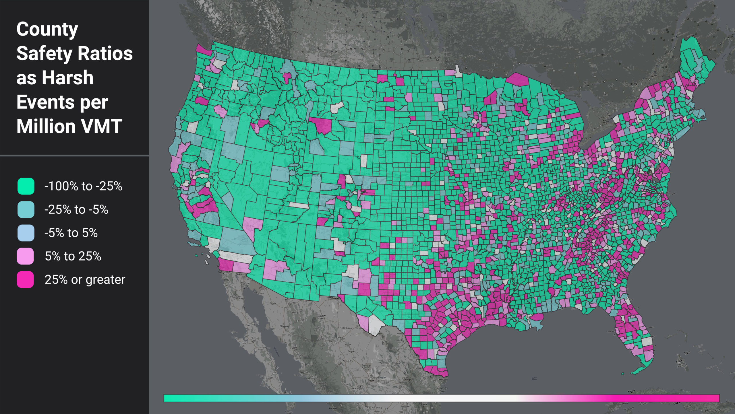
Figure 1: National heatmap of U.S. counties as measured by a ratio of harsh events (HE) per million VMT.
When we filter for the counties with higher-than-average HE per VMT, we see that certain regional patterns emerge. In Figure 1, areas around the Gulf Coast, the Appalachian region, and coastal/border counties light up. This pattern suggests further analysis into local factors such as topography, road curvature, percentage truck and pedestrian activity, and more to help us understand why these counties have such high HE per VMT ratios.
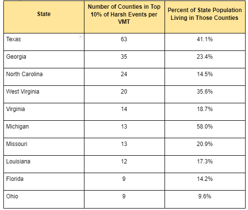
We also see that the top counties are confined to certain states. In fact, 13 states do not have a single county in the top 10%. For states with counties in the top 10%, some show up far more often than others. For example, 58% of Michigan’s population lives in counties with high rates of harsh braking events, while only 10% of Ohio’s population lives in similar high-risk counties.
Table 1: Top Counties by HE per VMT and Population Distributions
Calculating Population’s Effect
We wanted to assess if population was the real driver of a county’s higher-than-average HE per VMT, so we also analyzed harsh events per capita (HE per capita). We looked at each county’s HE per capita relative to the U.S. average (0.3), illustrated in Figure 2. Counties in green have lower than average HE per capita, while counties in blue have higher than average HE per capita.Summarized from “Private Versus Shared, Automated Electric Vehicles for U.S. Personal Mobility: Energy Use, Greenhouse Gas Emissions, Grid Integration, and Cost Impact” by Colin J. R. Sheppard, Alan T. Jenn, Jeffery B. Greenblatt, Gordon S. Bauer, and Brian F. Gerke, Environmental Science & Technology 55, no. 5 (March 2, 2021): 3229–39.


