Is Congestion Pricing Right for Atlanta?

From Los Angeles to New York, planners are talking about congestion pricing , and Atlanta is one of the metro areas involved in the discussion. Atlanta is the 3rd fastest-growing metro area in the U.S., and 11th most congested city in the country. “All options need to be on the table to address traffic. It’s a real quality of life issue that I’m committed to solving and will use all means to do that,” Councilman J.P. Matzigheit said on the news recently.
I have a lot of personal interest in this topic because I live and work in Midtown Atlanta. Since I also happen to work for a company that uses Big Data for transportation analytics, I decided to run my own sample study on Atlanta’s congestion. I found some insight on why congestion pricing may make sense for this busy city.
Why Congestion Pricing Is a Thing
Peachtree Street is a seven-mile corridor stretching north from downtown Atlanta through the Midtown area to Buckhead. The corridor comprises 58% of jobs in the city, and five times the population growth of the city at-large.
My analysis showed that on a daily basis, a total of 120,000 vehicles move along the five roadways stretching north to south in Midtown, the kind of volume that you’d usually see on a local interstate. But how many of these vehicle owners live in the city or county and pay local taxes?
It’s important to know who contributes to congestion because my local taxes bear the burden of paying for Atlanta’s MARTA transit system (which relieves congestion during the peak travel periods). But the city’s residents aren’t the only drivers contributing to congestion, and it seems fair to spread the responsibility for congestion among those who cause it.
Both the city and county have recently voted to increase our taxes to fund more local transportation projects, but some nearby counties have rejected such taxes.
Perhaps voters don’t fully understand their role in Atlanta’s congestion. To share that information, cities must run congestion studies, and disseminate the results. It’s not as easy at it sounds. Traditionally, the information required to support a congestion study has been difficult to obtain. This includes:
- Volume of trips
- Home locations of trips
- Work locations of trips
- Demographics of travelers
- Mode of travel
- Purpose of travel
- Frequency of travel


Until now, the only way to get this information has been via household travel surveys, employer surveys, or travel-demand modeling. Often, by the time this information is collected and analyzed, it is already outdated, and covers only a small sample of the population. But our new Home and Work Locations analysis covers everything a city needs for a congestion-pricing study.
Sample Congestion Analysis Data
I ran a sample Home and Work Location analysis using our data platform, StreetLight InSight®. I chose to study Spring Street, a major commuter road in Midtown. In just a few minutes, I uncovered some interesting outcomes:
- There are 29,000 trips daily on Spring Street.
- Atlanta locals make up only 22% of trips on Spring Street during weekday rush hours, with 78% of trips are coming from outside Atlanta.
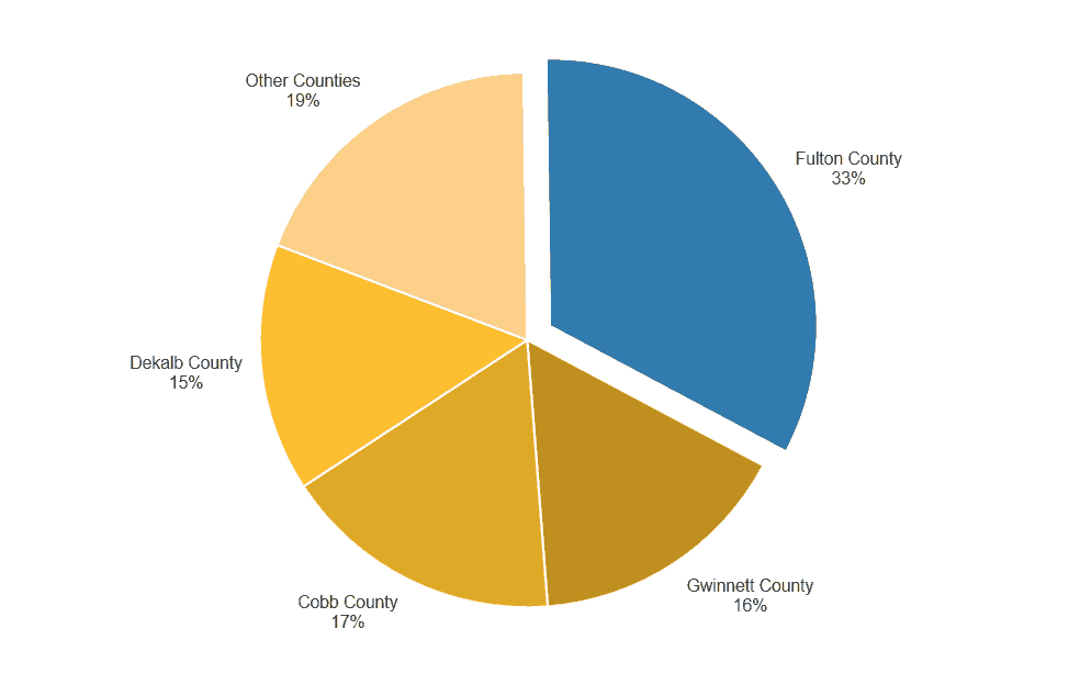
- Surprisingly, 16% of total trips are coming from Gwinnett County, a county where voters rejected paying into the MARTA transit system.
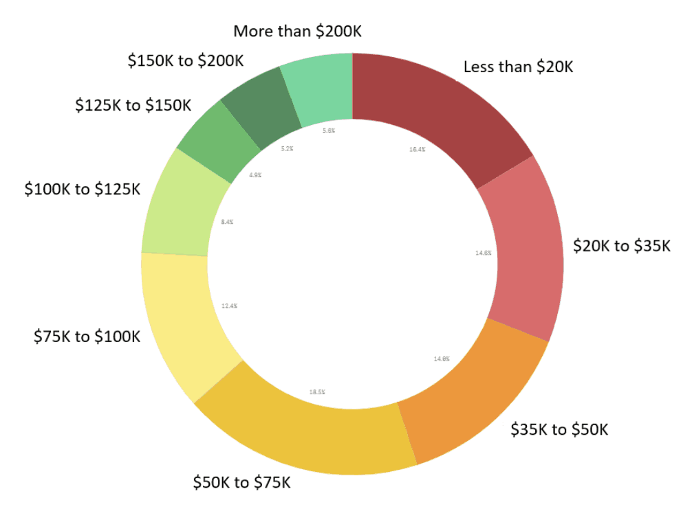
- People from a household with an income less than $35,000 a year make 26% of trips, while 30% of trips are made by people from a household with an income more than $100,000 a year.
- 66% of trips on Spring Street are more than 10 miles away from their home location, during the morning peak period.
Fig. 1: Home distribution of trips traveling on Spring Street.
In a region of almost six million people, Atlanta holds not even a tenth of that population. Armed with this level of information, city officials in places like Atlanta can be more informed when planning communicating with neighboring counties. Key takeaways from this quick study could inform a discussion about congestion pricing:
- The study’s demographic information highlights who will be impacted by congestion pricing.
- The volume data can help estimate the fee that could be collected through this program.
- Home locations can reveal areas where there are limited transit options, if congestion pricing negatively impacted certain demographic groups.
Fig. 2: Distribution of household income for Spring Street’s morning rush hour drivers.
As a next step, a planner could run the same analysis for all modes of travel for all roadways in Atlanta to get a more comprehensive picture of the travel pattern in the city. Reducing congestion is a hot topic for our customers, for Atlanta, and obviously for me.

