Connected Car Data Creates Road Safety Insights

Connected Car Data Creates Road Safety Insights
There were more fatal vehicle crashes in 2020 compared to 2019, according to the National Safety Council, all while the amount of driving as measured by Vehicle Miles Travelled (VMT) declined. This seems counterintuitive. If we want to reduce these fatal crashes, we must improve the way we measure and plan for safety. As we discussed in our Pedestrian Safety eBook, simply looking at a total number of crashes without taking other information into account could distort our understanding of the real safety risks to transportation system users in a particular area.
When StreetLight presented at the AASHTO GIS-T conference last month, we discussed the significant value that can be unlocked by blending transportation metrics with non-StreetLight datasets. Here we share an example from our safety solutions partner, Ford Mobility.
Factoring in “Harsh Events”
Ford Safety Insights, Ford Mobility’s web-based safety tool, offers connected vehicle data on various “near miss” indicators such as harsh braking, harsh acceleration, and hard cornering. We worked with Ford Mobility to compile the number of harsh events at the county level. Using StreetLight’s VMT Monitor Metric, we can calculate the number of harsh events per million VMT and analyze which counties in the U.S. have the highest ratios.
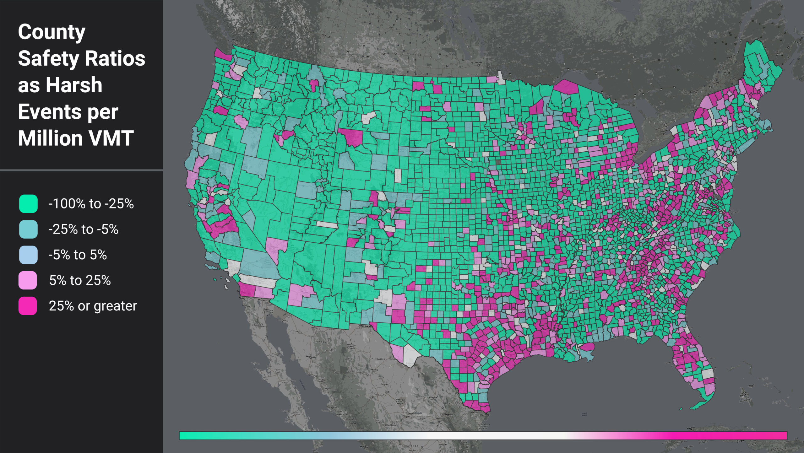
If one area has more harsh events just because they have more driving, that doesn’t really tell us much. But if an area has a lot of harsh events per mile travelled, then for any driver in that area, each mile driven is more dangerous than average. Figure 1 shows a heatmap of counties by their harsh events per million VMT (HE per VMT) ratio.
We compare each county’s HE per VMT to the nationwide average (29.36). The counties in teal color have a lower HE per VMT than the US average, and those that are magenta have higher.
Figure 1: National heatmap of U.S. counties as measured by a ratio of harsh events (HE) per million VMT.
When we filter for the counties with higher-than-average HE per VMT, we see that certain regional patterns emerge. In Figure 1, areas around the Gulf Coast, the Appalachian region, and coastal/border counties light up. This pattern suggests further analysis into local factors such as topography, road curvature, percentage truck and pedestrian activity, and more to help us understand why these counties have such high HE per VMT ratios.
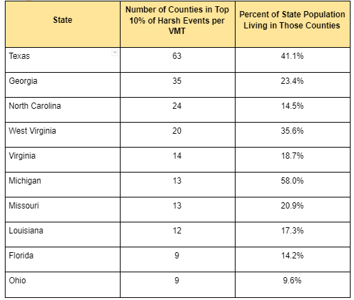
We also see that the top counties are confined to certain states. In fact, 13 states do not have a single county in the top 10%. For states with counties in the top 10%, some show up far more often than others. For example, 58% of Michigan’s population lives in counties with high rates of harsh braking events, while only 10% of Ohio’s population lives in similar high-risk counties.
Table 1: Top Counties by HE per VMT and Population Distributions
Calculating Population’s Effect
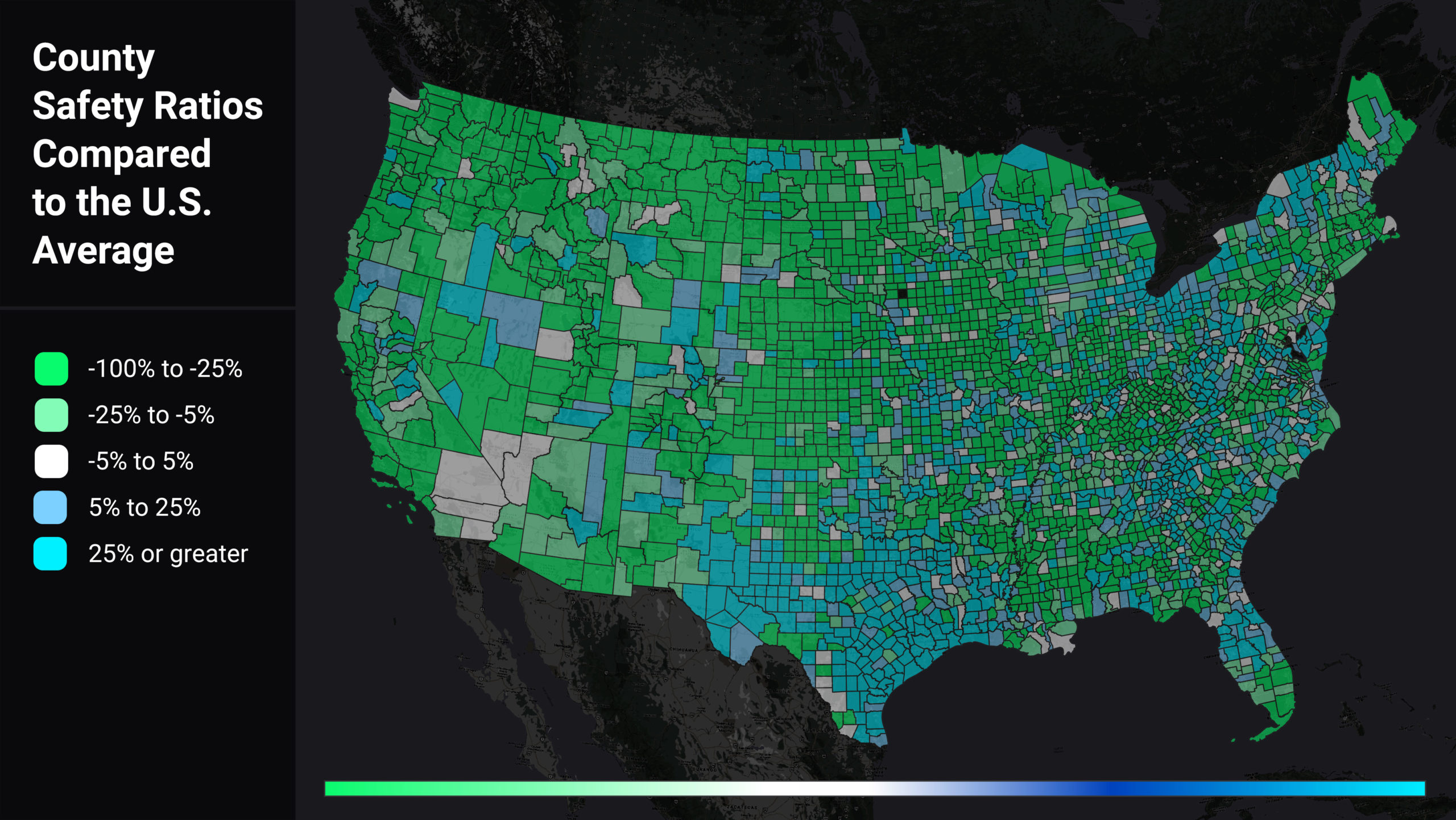
We wanted to assess if population was the real driver of a county’s higher-than-average HE per VMT, so we also analyzed harsh events per capita (HE per capita). We looked at each county’s HE per capita relative to the U.S. average (0.3), illustrated in Figure 2. Counties in green have lower than average HE per capita, while counties in blue have higher than average HE per capita.
Figure 2: Heatmap of U.S. counties by harsh event (HE) per capita, relative to the U.S. average (0.3). Green counties have lower-than-average ratios, while blue counties’ averages are higher.
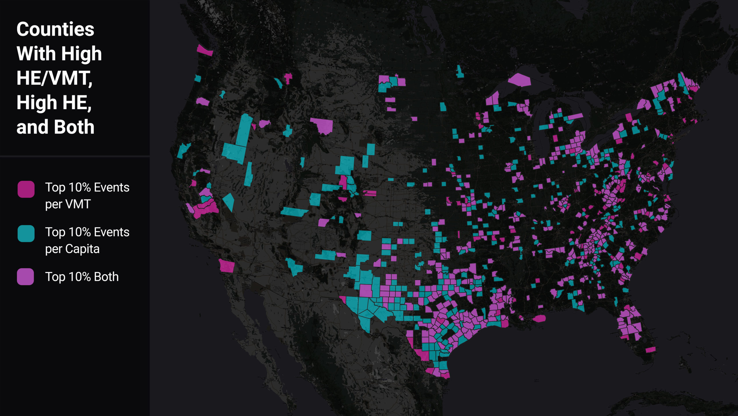
We found a majority of counties that have high HE per VMT also have high VMT per capita. However, there are 127 counties which are in the top 10% of harsh braking events per VMT and not per capita, indicating areas of especially high risk for locals. As shown in the map below, many of these counties are rural and situated along major highways. Thus these counties’ population may be bearing the safety impact of “cut through” drivers.
Figure 3: Heatmap of U.S. counties comparing those with high HE/VMT (magenta) to those with high HE per capita (aqua), and high in both categories (light purple).
Conclusion
We see here that integration of multiple data sources can better inform strategic safety planning and decision-making. Like crash and injury rates, which normalize crashes relative to the amount of travel, combining near-miss data with VMT and population data (and more) can help safety professionals proactively zero in on where crashes are most likely to happen, and implement appropriate safety measures. This approach is another data point, and another tool in the toolbox, for making progress toward zero deaths.Summarized from “Private Versus Shared, Automated Electric Vehicles for U.S. Personal Mobility: Energy Use, Greenhouse Gas Emissions, Grid Integration, and Cost Impact” by Colin J. R. Sheppard, Alan T. Jenn, Jeffery B. Greenblatt, Gordon S. Bauer, and Brian F. Gerke, Environmental Science & Technology 55, no. 5 (March 2, 2021): 3229–39.
Surprising Changes to Traffic Congestion in Urban Areas

Surprising Changes to Traffic Congestion in Urban Areas
Analyzing travel in major metropolitan areas throughout the U.S. shows surprising new patterns that only a granular analysis can decipher. Specifically, the data shows that while total miles driven are similar to February 2020, big changes have arisen in when and where trips occur in metropolitan areas.
Essentially, we see the same vehicle miles travelled (VMT) in metro areas, but without the same level of congestion, and in new locations. This decoupling of VMT and urban-area congestion shakes many of the foundations of our models and decision tools about transportation infrastructure, investment, funding, mode choice, and more.
Significant Shift in Rush-Hour Trips
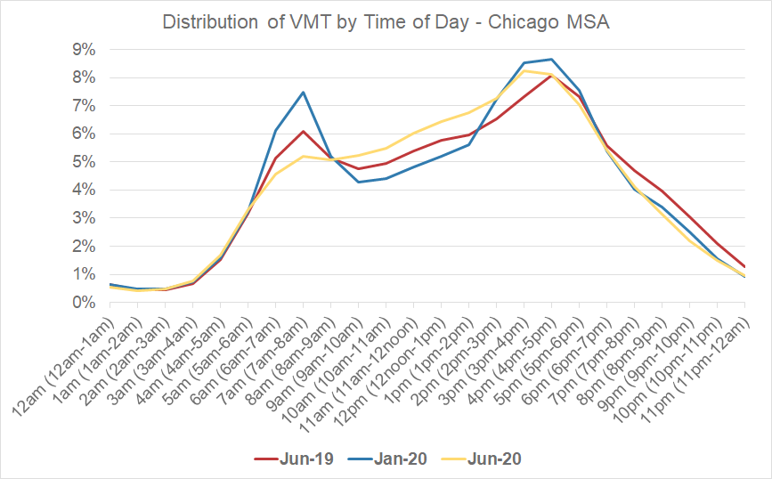
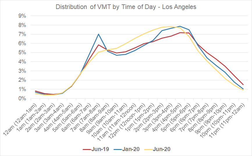
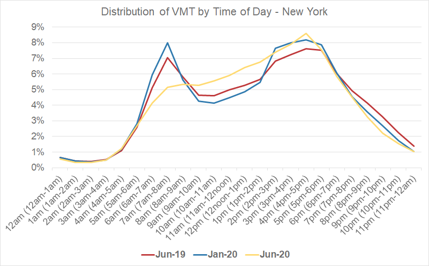
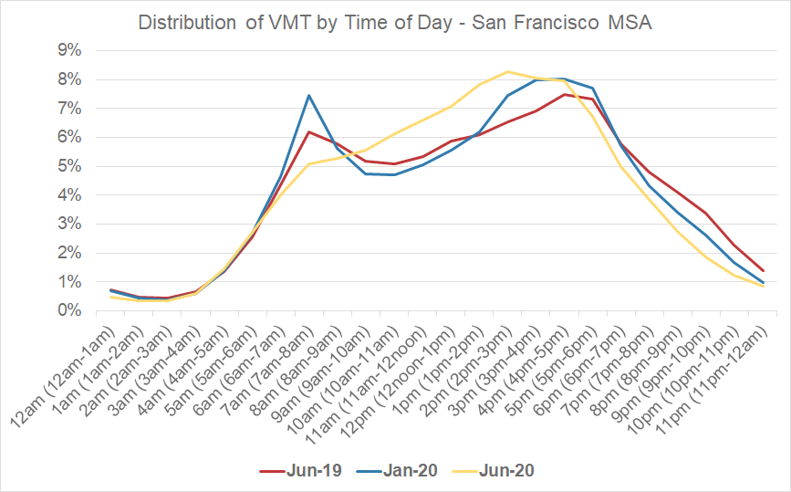
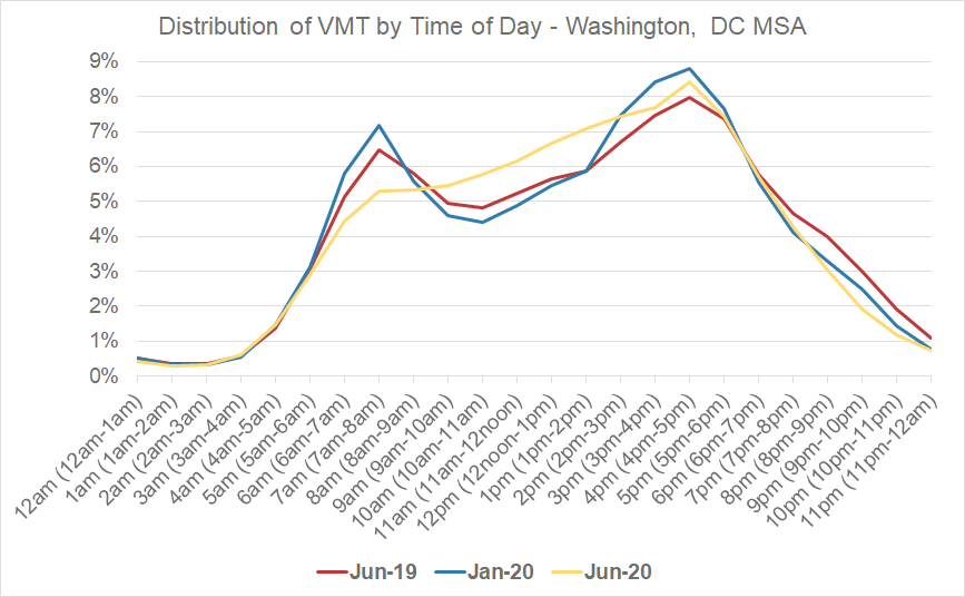
In the past, when we have looked at trips by time of day (especially weekday trips), we have always seen a “bi-modal” trip distribution. These are our traditional peak AM and peak PM periods, coinciding with commuting to and from work for many employees.
Now, when we examine the hourly distribution of VMT in metro areas, we see a “smoothing” of peak AM travel time during what has traditionally been the morning commute period. These trips are shifting (or being replaced) with more trips happening during the midday hours.
For five separate MSAs, we looked at the distribution of VMT by time of day for average weekdays in June 2019 and January 2020 (pre-COVID), compared to June 2020 (post-COVID). In all cases, we see the bi-modal peaks in the pre-COVID periods, as well as the reduction of the morning commute peak in the post-COVID period across all five MSAs.
We still see peak PM travel behavior, along with more VMT in the afternoon than before.
Figure 1: Hourly VMT analysis for the Chicago MSA.
Figure 2: Hourly VMT analysis for the Los Angeles MSA.
Figure 3: Hourly VMT analysis for the New York MSA.
Figure 4: Hourly VMT analysis for the San Francisco MSA.
Figure 5: Hourly VMT analysis for the Washington, D.C. MSA.
Decentralized Urban Travel
When we examine where post-COVID trips originate, we see a decrease in metro area trips in city centers, and an increase in trips farther away from the traditional downtown/core urban areas.
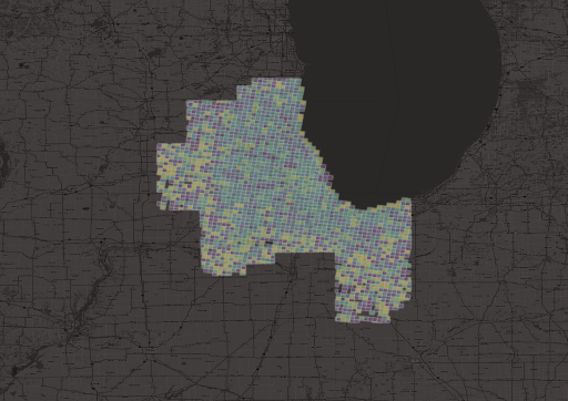
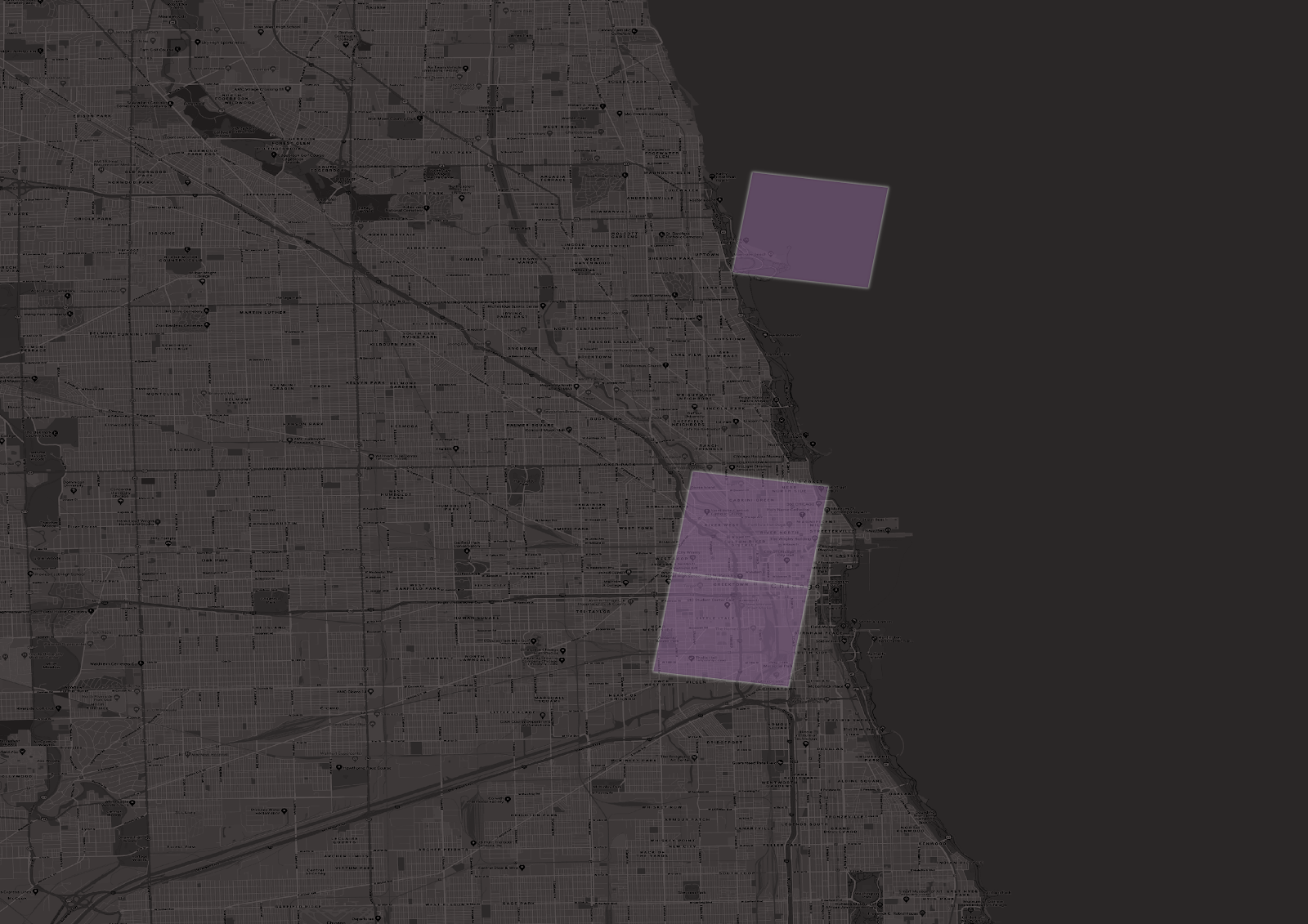
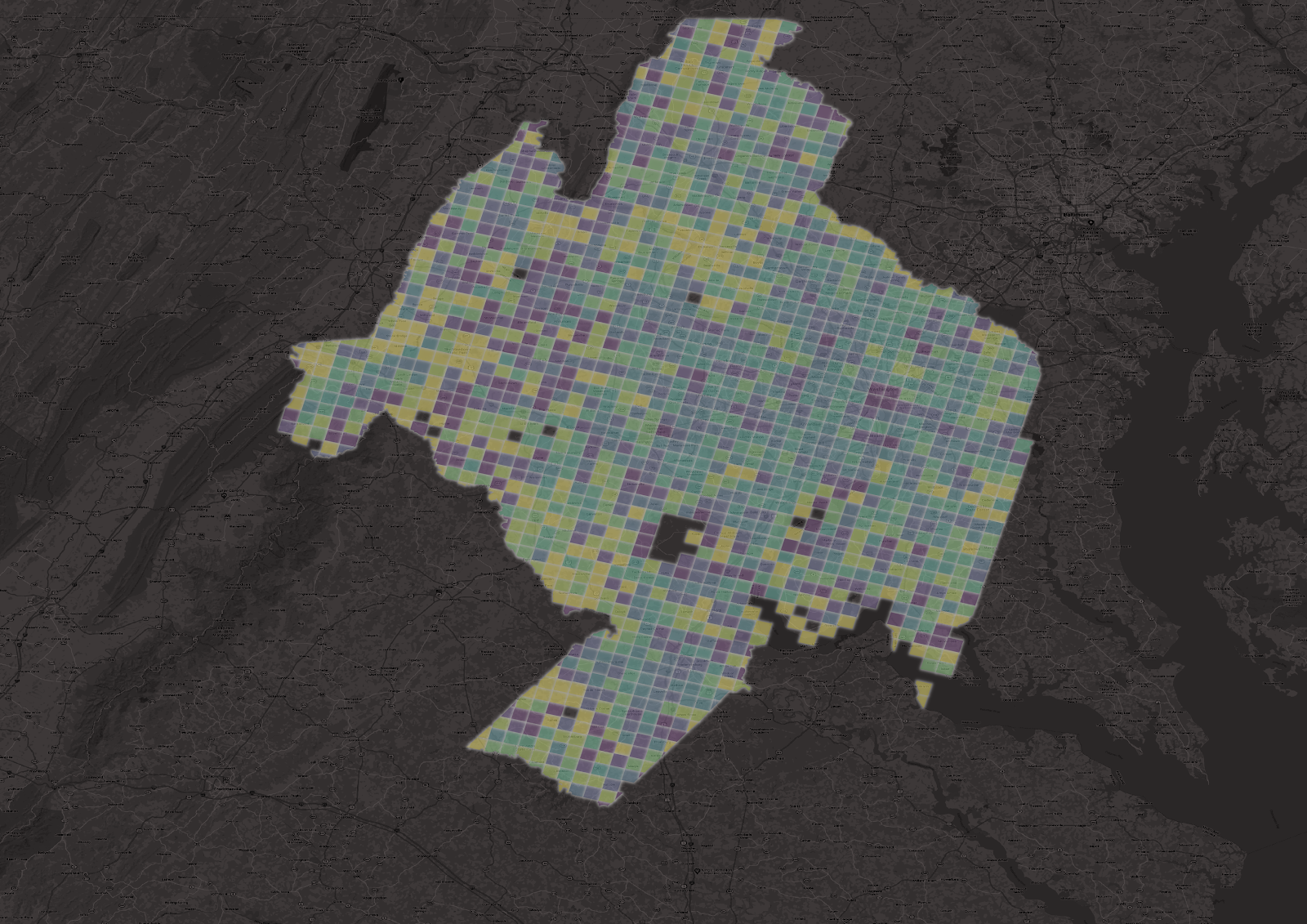
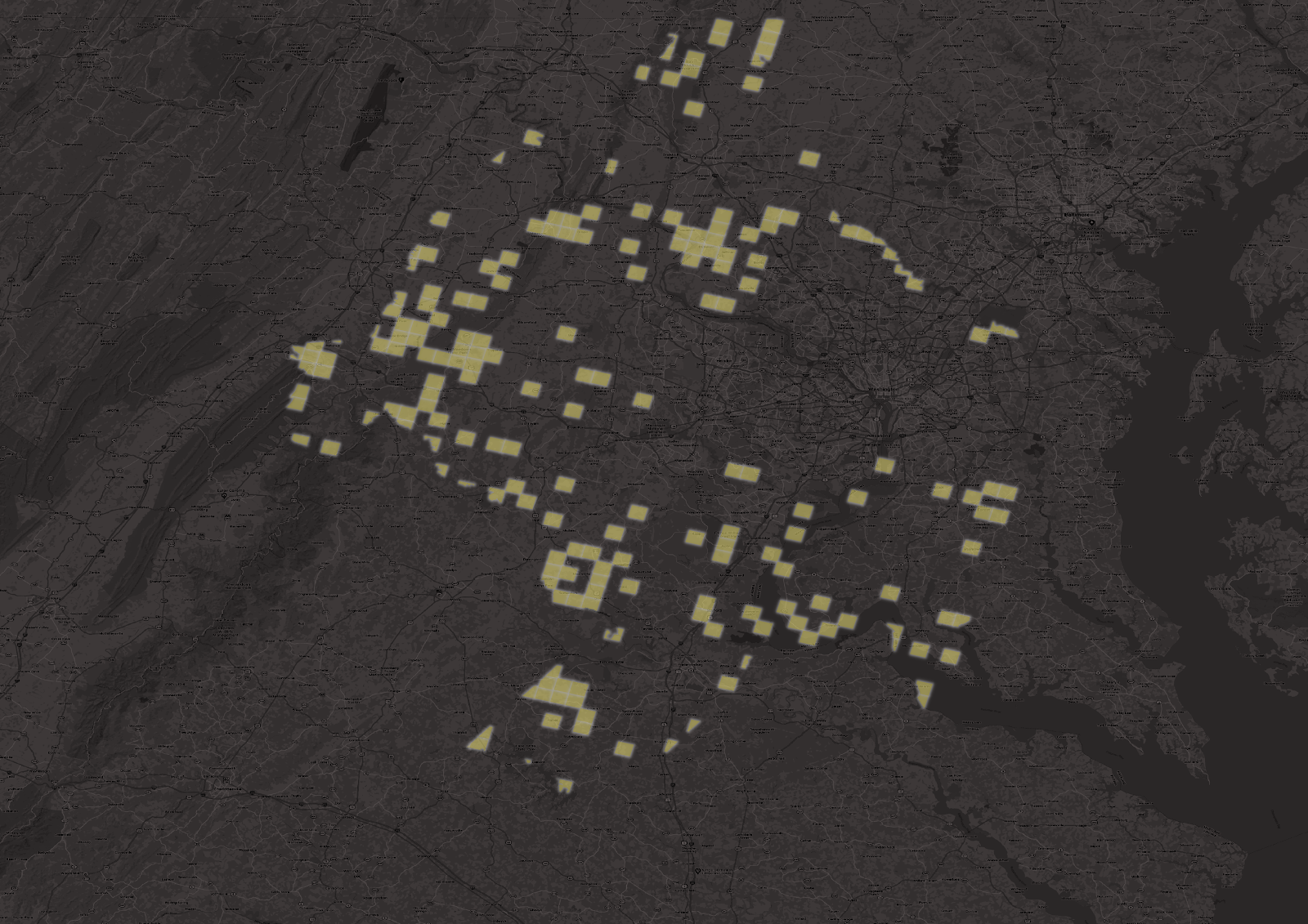
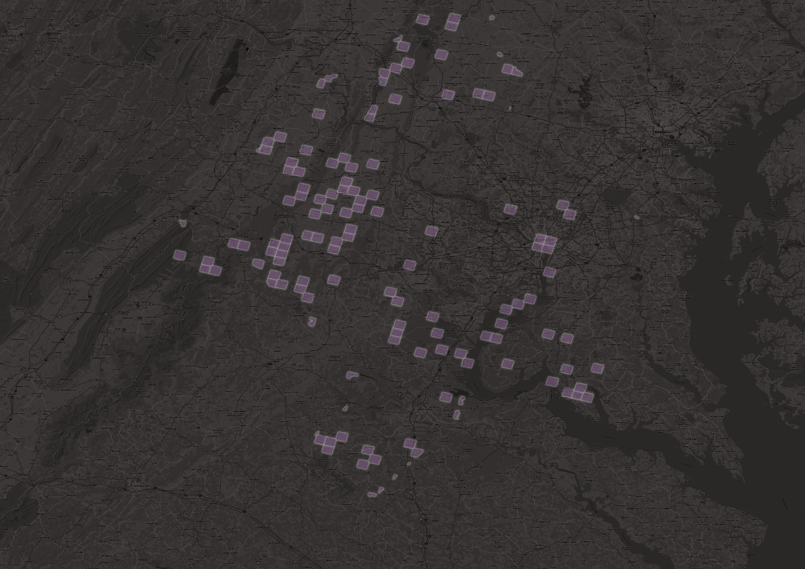
Highlighting the Chicago and Washington, D.C. MSAs at a granular spatial level, we found that the areas with the largest decrease in trips between 2019 and 2020 were in the core urban/downtown/central business districts of the MSAs. Areas in the less densely populated outer regions of the MSAs saw actual increases in trips, year over year.
In the image below, we have plotted the percent change in trip starts throughout the Chicago MSAs, in 3km grids. The darker the shading, the higher the percent decrease in trip starts. The light-yellow represents increases in trip starts in June 2020 compared to June 2019.
Figure 6: Overview of change in trip starts from June 2019 to June 2020 for the Chicago MSA.
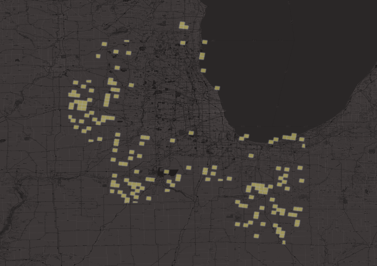
When we plot just the grids where trip starts have increased year over year, we see there is a large concentration of this activity in the outer regions of the Chicago MSA.
Figure 7: Chicago areas with trip increases from June 2019 to June 2020.
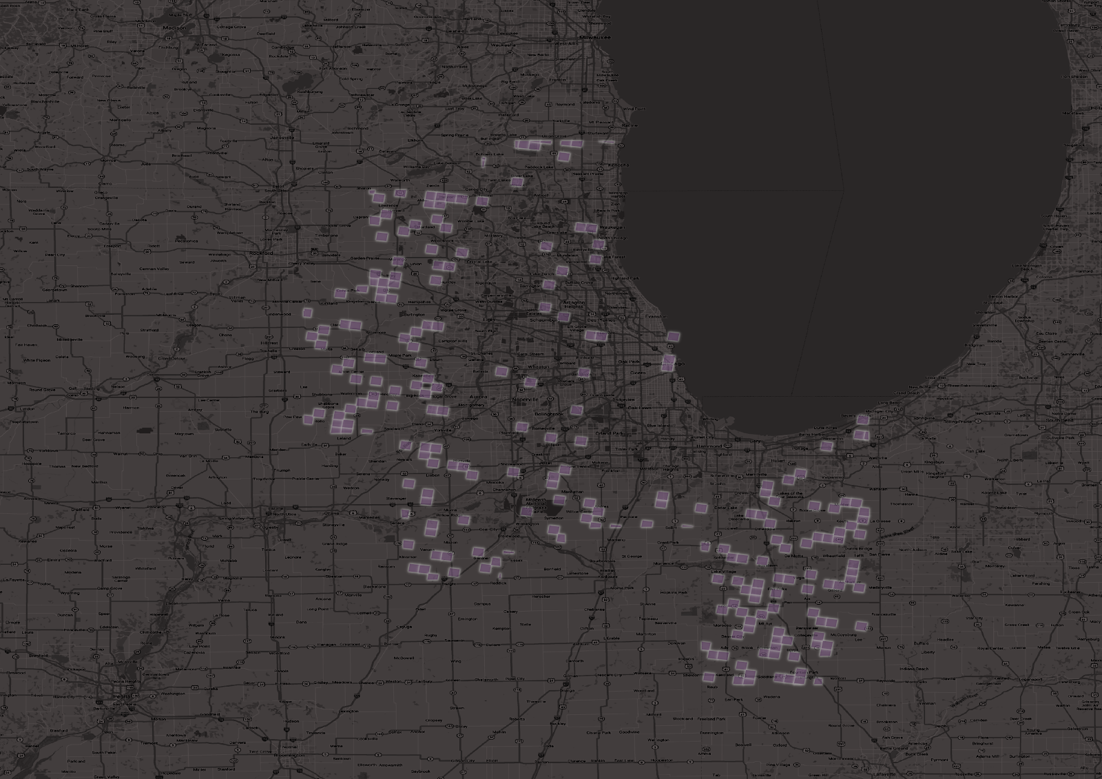
Conversely, when we plot the areas with the largest percent decreases in trip starts, we see locations closer to Chicago’s urban core.
Figure 8: Chicago areas with the largest trip decreases from June 2019 to June 2020.
When we zoom in on Chicago’s urban core, we see it is included.
Figure 9: The Chicago MSA urban core shows significant decreases in trip activity from June 2019 to June 2020.
When we examine the Washington, D.C. area, we see a similar pattern as well.
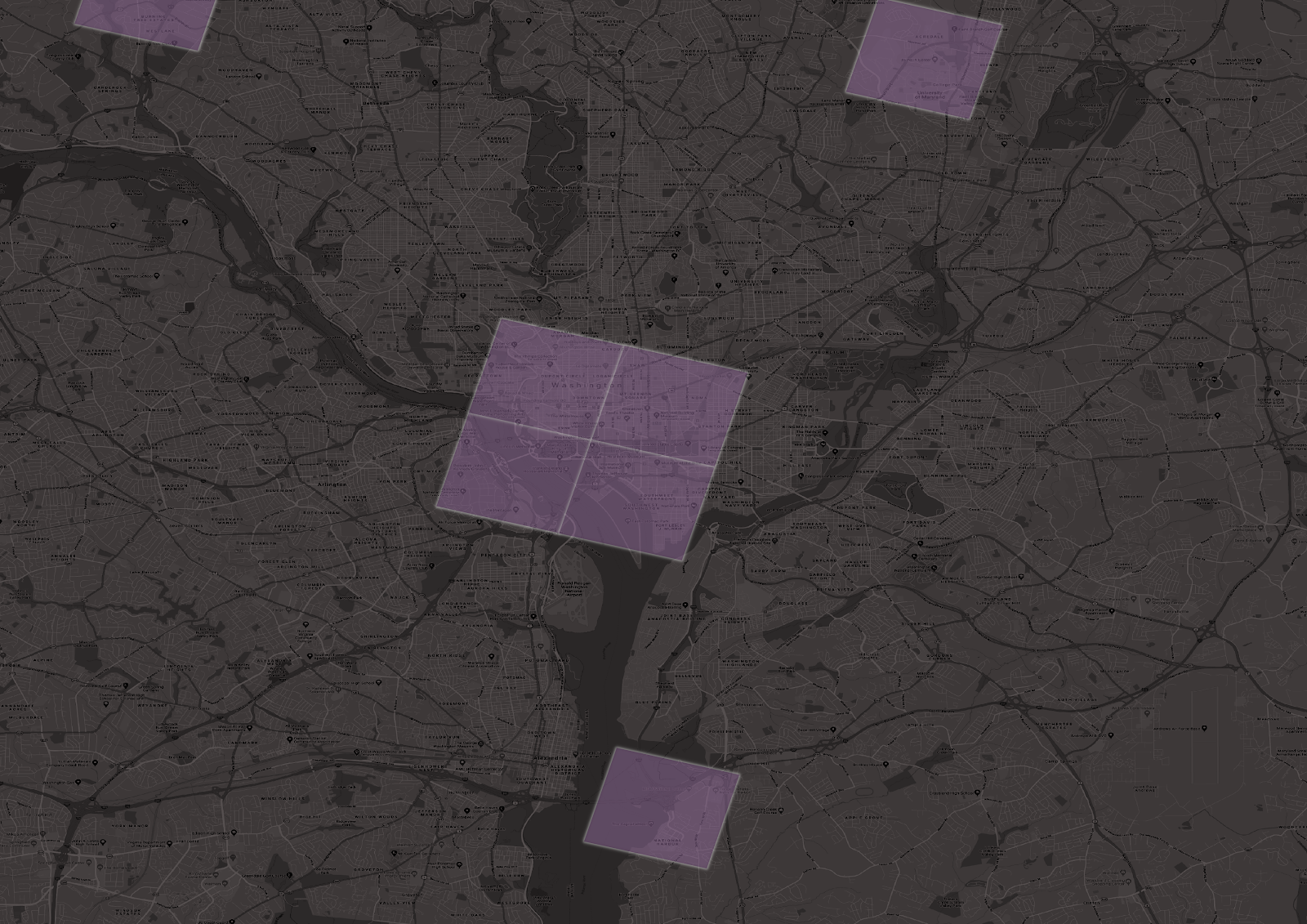
Figure 10: Overview of change in trip starts from June 2019 to June 2020 for the Washington, D.C. MSA.
Figure 11: Washington, D.C. areas with trip increases from June 2019 to June 2020.
Figure 12: Washington, D.C. areas with largest trip decreases from June 2019 to June 2020.
Figure 13: The Washington, D.C. MSA urban core shows significant decreases in trip activity from June 2019 to June 2020.
Monitoring Future Changes
Transportation models have relied on assumptions about established time-of-day trip patterns, but these patterns are changing. It is extremely important to monitor travel patterns and behaviors during these times — and to dig deeper with hourly and location-specific metrics. Even when our quarantines and work-from-home requirements relax, it’s possible that some of these behavior shifts will stick. Understanding the new and emerging behaviors will help transportation professionals plan for the future in a more effective manner.
How Big Data Supports Environmental Justice in Transportation

How Big Data Supports Environmental Justice in Transportation
Two of the questions we’re often asked here at StreetLight Data are: “What percentage of the population does your sample capture?” and “Is the location data in your sample biased in some way, or does it fairly represent all groups?”
We recently revisited the data that supports StreetLight’s Metrics to examine how representative it is. Our analysis shows that the location-based services (LBS) data we use closely represents the population at large – more so than typical surveys. Broader representation of all groups is an important benefit of big data in transportation.
Fundamentally, we believe (and research backs this up) that more equitable data and sampling will lead to more equitable transportation policies and infrastructure planning. These policies and plans have generational impacts due to the lifecycles of these investments.
As a very simple example, if no one from a certain block group is included in a survey then the planners may never know that it takes twice as long for that community to get to work compared to the average, and not take actions to correct this inequitable distribution of transportation and accessibility. If lower-income block groups are more often the ones not included, then a systemic community wide bias in allocation of transportation planning can develop.
The U.S. DOT includes a core principle of equitable transportation planning as “full and fair participation by all potentially affected communities in the transportation decision-making process.” If data is not collected from a group of people, they simply cannot fully participate.
Key Questions for Data Suppliers
When we evaluate LBS data to purchase from suppliers, our goal is to answer two key questions:
- What is the data set’s sample share? In other words, what percentage of a given region’s population uses the devices that create the location records in the sample?
- In terms of income, are the device users in the data set representative of the people who live there? In other words, do the incomes of the device users in our sample match the distribution of income levels of people living in that region?
- Also important (though not discussed here), what percentage of each sample devices’ trips are captured in the data set?
In this blog post, we will demonstrate how we answered the first two of these questions for the state of Florida. Florida is an excellent case study because it is a populous state with a diverse range of incomes, industries, and land uses.
While there are regional variations in our sample, our findings in Florida are similar to our findings for the rest of the United States. (Note: This post does simplify the actual algorithmic processing and data science performed, so apologies to our Data Science team!)
Device Penetration Rate
To determine device sample share rates for LBS data, our first step is to estimate the number of devices in our sample that “live” in a particular area. Next, we compare that number to the region’s total population per the most recent U.S. Census.
First, we look at devices’ locations during nighttime hours, when people tend to be near their residences. Based on how many nighttime hours devices spend there, we assign a probability that devices are affiliated with a particular Census block. A device is disaggregated, so 30% of it might belong to one block, 30% to another, and 40% to a third. For clarity’s sake: We do not have any personally identifiable data (just points in space and time) about device owners.
Our next step is to add up all the devices in our sample that are probably affiliated with each Census block. If we assign 15 devices to a given Census block that 100 people live in, that means our device sample share for that Census block is 15%. Since published StreetLight Metrics include only information about groups of people – even in blog posts – we aggregated all of the Census blocks in this study into tracts. Keep in mind that about 30 people live in the average Census block, and about 6,000 people live in the average Census tract.
Results for Florida: 13% Device Sample Share
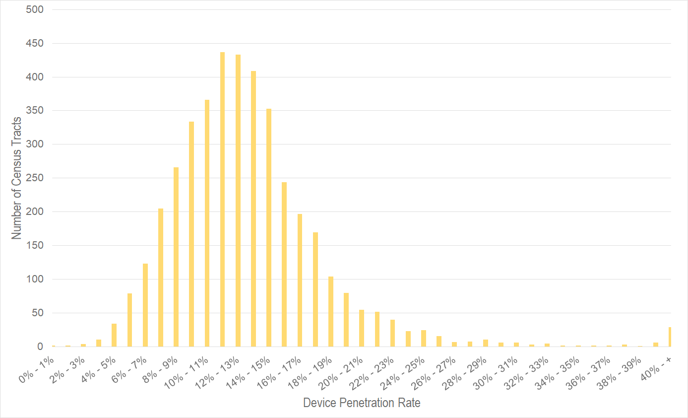
Our average device sample share across all of Florida is 13.1%. This number holds very steady across the tracts. Figure 1 (below) shows a histogram for all 4,000+ tracts in the state of Florida. As you can see, 90% of tracts have a penetration rate between 6.0% and 20.0%. This is a very consistent sample.
Figure 1: Histogram of Florida tracts by device penetration rate. StreetLight adjusts its sample to correct for the variance in tract penetration rate, so any StreetLight Metric accurately represents the general population.
This device sample share rate also impacts how we calculate our travel pattern analytics. If a device in a customer’s analysis is affiliated with a block with a 5% sample share, we’ll treat that device differently from a device that lives in a block with a 10% sample share. Essentially, our algorithms automatically scale our Metrics to account for our sample share rates at the devices’ Census blocks. If you would like details on this process, see our Data Sources and Methodology white paper.
In most of the U.S.. people tend to live near others like themselves. So by normalizing at a granular level for residential geography, we also normalize for demographics.
Digging Into Income Bias
When it comes to bias, our clients often ask first about income. Many of us in the transportation industry have spent years controlling for income bias in samples, and having a representative sample is a critical component of ensuring that transportation plans, infrastructure, and policies are equitable. So we take it very seriously! Keep in mind that this same type of bias analysis can be extended to other Census demographics.
To explore income bias in our sample, we use the same aggregate “device home-block locations” that we used for our sample share analysis. We focus on the block group level. In terms of population, block groups rank between Census blocks and tracts. The American Community Survey organizes its statistics for income by block group, and we use their statistics for this analysis.
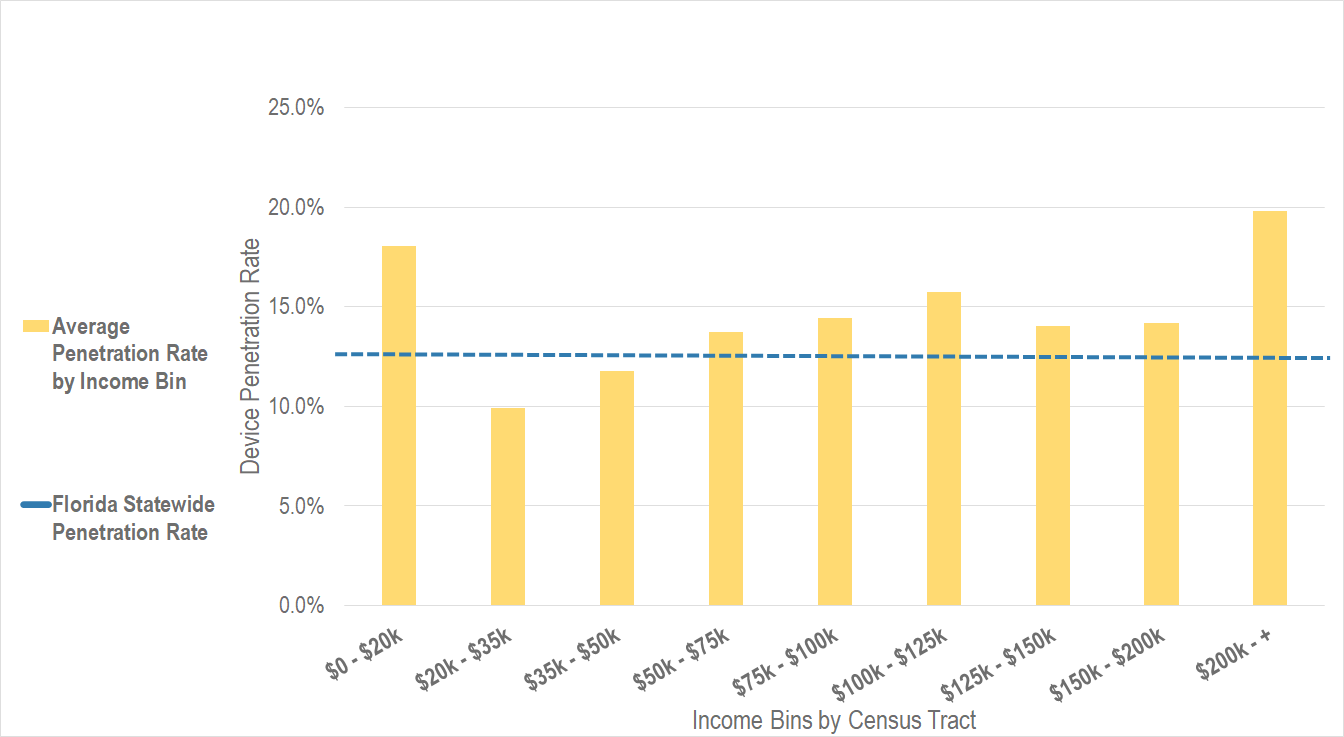
Once we have our sample share by block group, we determine the average income of each block group. Our goal is to find out if our sample share is different across higher income and lower income block groups. For this case study, our answer is no – the penetration rate is similar across all income levels, as shown in Figure 2 below.
Figure 2: Device penetration rate by tract average income. StreetLight adjusts its sample to correct for this local difference in sampling by residential geography, so that any StreetLight Metric accurately represents the general population.
Importantly, our data is more evenly distributed and less biased than any household travel survey we have come across. This is for several reasons – bias in who chooses to answer a survey, language barriers, lower sample sizes in general, polling method (using landlines for example) and more.
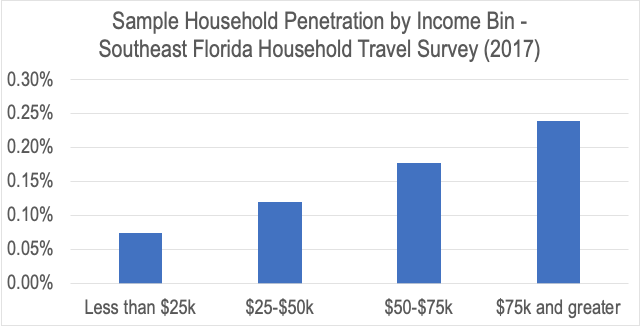
These differences have been widely documented in the academic literature. For example, the 2017 Southeast Florida Household Travel Survey sample shows nearly 100x smaller sample penetration compared to ours, and the sampling rate for households making $75k and more was 3.2x the rate of households making $25k and less.
Figure 3: Southeast Florida Household Travel survey sampled higher income households at 3.2x the rate of lower income households, unlike StreetLight which has a very similar rate for high and low income. Also StreetLight’s sample covered ~100x more devices for many more days.
While the survey team followed all best practices in normalizing this biased sample it is simply much more difficult to normalize when sampling rates vary to such an extreme.
Digging Into Other Bias
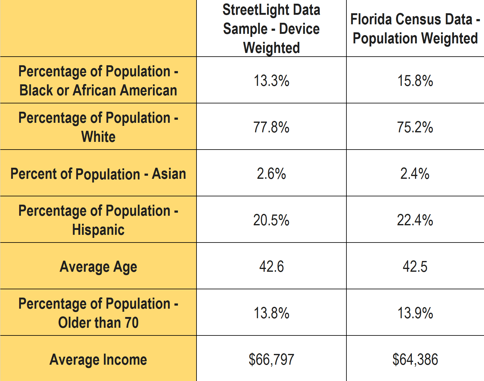
Socio-economic factors include characteristics beyond income. We compared our StreetLight sample-device weighted percentages to the reported U.S. Census-population-weighted estimates for a handful of other demographic variables. The data is presented in the table below.
What we see in our data is that our sample for Florida closely represents the population at large. Another promising proof point that our data reflects the diverse characteristics of the geographies that our customers analyze with StreetLight. Lastly, it bears repeating that any metric that is expressed as StreetLight Volume has been normalized for any local bias or sampling variation.
Going Further: An Invitation to Explore Our Data
We’ve provided the “bird’s eye” view of our sample’s representativeness in Florida, and we also want researchers and analysts to understand how that plays out when the data is converted into StreetLight Metrics.
For more detail about the methodology and validation supporting our analyses, we invite you to explore our various white papers, and in particular Our Methodology and Data Sources.
1Note – the current StreetLight Indices for bikes, pedestrians, and trucks do not use the Census penetration for normalization, both use other grounding data instead. See the full documentation for details.


