Zero in on the Best Corridors for Bike Safety
New York City has a reputation for being a dangerous city for cycling, but transportation planners are attacking the issue. The city has taken on the Vision Zero challenge, a bold initiative intended to end all traffic deaths and serious injuries by 2024.
But are NYC planners — or any city’s planners — targeting high-exposure areas? Our new research report, Bike Safety Shift: Top 10 Riskiest States, leverages StreetLight’s Bicycle Metric to examine bicycling safety in a more granular way. Here we summarize one city’s analysis as an example for cities and states everywhere, so planners can invest wisely in bicycle safety through infrastructure planning that has the most impact.
High Bike Activity or Crashes May Not Equal High Risk
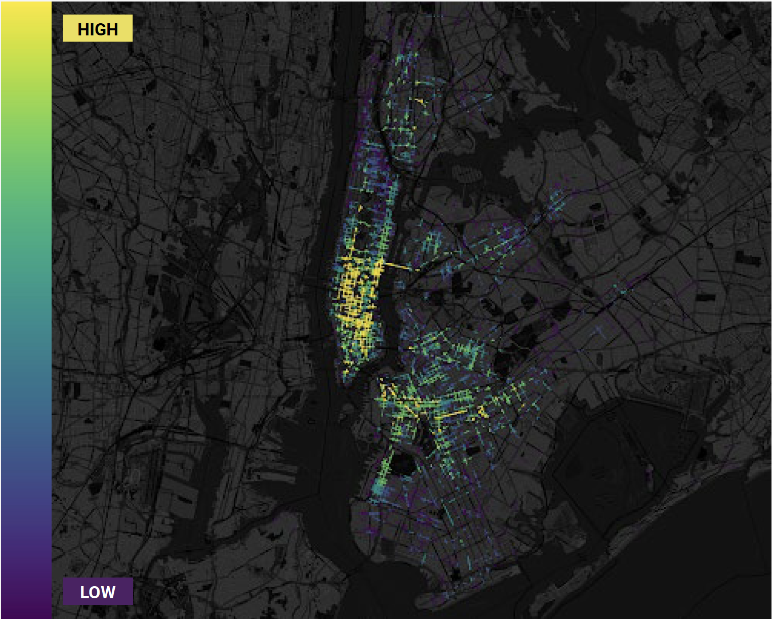
Traditional wisdom for any city might say to prioritize bike safety efforts in the densest areas where cyclists ride more. Or planners might choose to focus where more fatal crashes happen. In New York, most bike travel (and fatalities) happen in Lower Manhattan and central Brooklyn.
But when we capture the number of bike trips on all corridors across the boroughs, and then compare that to the number of crashes (not just fatalities), we find that exposure is actually higher elsewhere in NYC.
Planners have relied on incomplete statistics to calculate exposure because that’s been the best data that could be captured with sensors, surveys, and police reports. But focusing efforts based on population density or number of fatalities may not return the most significant bike safety results.
Figure 1: Heatmap of number of bike trips in New York City, 2018 and 2019.
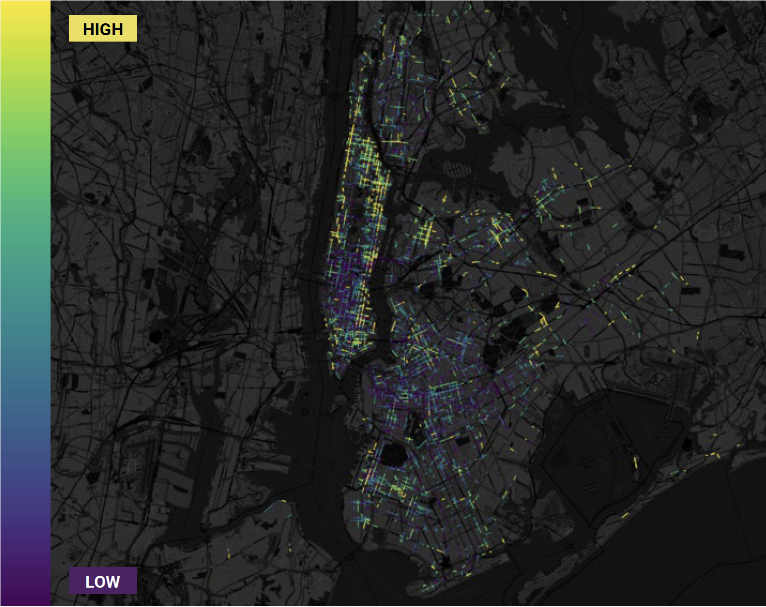
Our analysis focused on cycling-centric data by using a unique process. We plotted all 4,127 NYC bicycle incidents on our map, and color-coded locations based on how many bike trips passed by those crash points. In this way we accounted for just the bike riders instead of the entire population.
Figure 2: Heatmap of bike exposure areas, calculated by comparing bike crashes to number of bike trips.
When we plotted the comparison of bike crashes to bike trips, high-density cores in Midtown Manhattan and central Brooklyn stand out as low-risk areas. By contrast, Harlem and the Lower East Side light up with several high-risk bicycling corridors.
Traditional models may under- or over-inflate bicycling danger based on overall population numbers. StreetLight’s data can zero in on the real experiences of cyclists.
The Human Touch: Data Interpretation
StreetLight’s bike safety study reveals a lot about bike safety in NYC, but the data only goes so far. Data offers the “what” of planning, while the touch of an expert delves into the “why.” Planners have local intelligence to combine with the data for key insights.
For example, do some corridors have more cohesive bike infrastructure than others? Maybe bike lanes in some corridors have poor markings, or even lanes that start in one block and abruptly end a few blocks later.
Automobile speeds and volumes may shift dramatically from block to block. Or maybe a nearby school indicates more children riding and walking. It takes the critical eye of a city planner with expertise in their own city to bring data to life.
Even in large-scale projects, resources are finite. Data plus local expertise can optimize safety projects, making the reach for zero fatalities all the more possible.Summarized from “Private Versus Shared, Automated Electric Vehicles for U.S. Personal Mobility: Energy Use, Greenhouse Gas Emissions, Grid Integration, and Cost Impact” by Colin J. R. Sheppard, Alan T. Jenn, Jeffery B. Greenblatt, Gordon S. Bauer, and Brian F. Gerke, Environmental Science & Technology 55, no. 5 (March 2, 2021): 3229–39.


