Category: Safety
Before and After a Protected Bike Lane: How Multimodal Infrastructure Impacts Safety, Congestion, and Ridership

Before and After a Protected Bike Lane: How Multimodal Infrastructure Impacts Safety, Congestion, and Ridership
In the business district of North Kansas City, Missouri, planners envisioned a corridor where cyclists and vehicles could coexist safely. Would a protected bike lane increase bicycling and reduce speeding without causing congestion? A before-and-after study—powered by StreetLight analytics—reveals what happened.
In 2019, Armour Road in North Kansas City, Missouri, underwent a series of improvements. The new infrastructure added brightly colored crosswalks, pedestrian refuges, and a new protected bike lane.
The bike lane was separated from vehicle traffic by a floating parking lane running parallel to the road, as well as special buffers and markings—a design intended to keep cyclists safe.
This image shows workers installing the bike lane demonstration project.
North Kansas City promotes itself as a livable city with suburban character. Armour Road is a principal thoroughfare running through the city’s downtown and adjacent commercial area. The bike lane installation wasn’t a routine upgrade, but a core part of the city’s broader plan to invest in biking and walking infrastructure, accessible urban destinations, and a vibrant cultural and business scene.
In working toward their vision, the planners had multiple goals for the Armour Road bike lanes. They wanted to promote efficient travel, but also safety and a greater amount of biking and walking in the heavily trafficked district.
To see if the new infrastructure worked, StreetLight conducted a before-and-after study using StreetLight InSight®, an on-demand mobility analytics platform. The study analyzed whether three of the stated policy goals of the Armour Road project were achieved. Specifically, did the bike lane:
- Encourage biking so it makes up a greater overall share of traffic volume
- Lead to a safer corridor with less speeding
- Improve or at least maintain travel times
Planners can use StreetLight to complement more expensive, traditional methods of measuring traffic volume and vehicle speeds, such as direct observation, surveys, and counters. In this instance, there were several advantages to using StreetLight’s analytics for a data-driven, self-serve approach:
- First, we were able to easily run multiple analyses to account for the possible distorting effect of 2020 pandemic restrictions. The bike lane was completed in late 2019, so our analyst ran the “before” data for the months of January to March of 2019. Although the obvious approach would have been to compare that data to the same period in 2020 (as the “after”), the tail end of that interval was affected by pandemic-driven lockdowns and altered traffic patterns. So we ran the data for January to March of 2021 as well, resulting in three sets of data to compare.
- Second, we were able to inexpensively compare Armour Road data to a control road in the study area. Using StreetLight’s platform, the analyst measured bike activity on East 21st Street, a nearby road that runs parallel to Armour Road, to see if the new bike lane pulled in bike activity that would have happened elsewhere or actually increased biking activity overall.
- Third, StreetLight captured nighttime bike volume that traditional methods usually can’t measure. Because traditional techniques often only operate well in daylight or business hours, they can miss a significant slice of volume. Later analysis showed that 15% of bike usage on Armour Road happened in night hours between 7 p.m. and 7 a.m., which likely would have been missed with traditional data collection.
- Finally, StreetLight’s platform allowed for quick, multimodal snapshots and a synthesis of metrics tied to very different dimensions, including traffic share, safety, travel times, and congestion rate.
A visualization from StreetLight InSight® of bike volume on Armour Road from the 2019 study period shows how the distribution of volume (shown by the yellow line) peaks near midday but shows significant volumes in other parts of the day such as late evening, when traditional data collection is difficult.
The safety question was high among planners’ concerns.
As StreetLight Speed Metrics confirm, in 2019 drivers were speeding on Armour Road, with as many as one in every 20 car trips down the corridor moving in excess of 40 mph (miles per hour), despite a posted speed limit of 25 mph. After project implementation, the share of drivers going above 40 mph dropped to almost 0, significantly reducing the risk that pedestrians will be killed or seriously injured in the event of a crash.
As planners know all too well, higher vehicle speeds lead to an exponentially higher probability of severe injury or death in vehicle collisions with pedestrians. A widely cited AAA study shows that in the U.S., the average risk of severe injury for a pedestrian struck by a vehicle reaches 25% at 23 mph, but is three times higher, 75%, at 39 mph. The chance of death for pedestrians struck by a vehicle is on average 10% at 23 mph and 50% at 42 mph.
Ideally, a safer Armour Road would see less speeding without a significant increase in travel times or congestion.
Of course, the main purpose of bike lanes isn’t simply to slow down speeding cars—it’s to encourage bike activity. And planners wanted to make progress on the city’s goal of encouraging bike use.
The before-and-after: Reduction in speeding, doubling of bike traffic, and more
As hoped, bike traffic on Armour Road increased its share of the traffic-volume pie, according to StreetLight’s measurements.
Before the bike lanes, in early 2019, bikes accounted for only 1% of the daily trips on Armour Road. In early 2021, biking’s share had grown to 2%. That may seem like a modest increase but represents a significant uptick in day-to-day bike travel: there were around 50 daily bike trips on average passing through the study sites along the corridor in early 2019. In 2021, after the protected bike lane went in, that number more than doubled to 114.
But was this the result of cyclists from other neighborhoods and bike routes being attracted to the upgraded Armour Road corridor? Or is there evidence that some of the biking would not have happened without the bike lanes?
As mentioned, that’s where the control data became useful. While less trafficked overall than Armour, the control segment on East 21st Street saw a proportional increase in bike traffic between 2019 and 2020 (though it remained flat between 2020 and 2021). The lack of a decrease in biking on East 21st Street supports the hypothesis that the new bike lane led to an overall net increase in biking’s adoption in the study area, rather than simply funneling in preexisting bike traffic.
In terms of safety, the most significant safety improvement was possibly a life-saving one. The bike lanes led to the near elimination of the most dangerous speeds—vehicles traveling above 40 mph, which had previously been roughly 5% of vehicles.
A visualization from StreetLight InSight® of average speed on Armour Road in the 2021 study period shows how the bike lane curtailed speeding. There are very few instances of vehicles traveling above 40 mph (shown in green) when that proportion was much higher before, about one in every 20 trips.
As for congestion, which is measured in several ways, it saw a slight increase. When looking at congestion rate, or the proportion of hours of the day in which congestion occurs, there was an uptick from 13% to 20% between the 2019 and 2020 study periods. In 2021, however, the congestion rate slipped back to 18%.
But did this congestion meaningfully impact travel time?
Travel time data showed that vehicle trips through the corridor were taking on average 124 seconds in 2019, and 129 seconds in 2021, an increase of only 5 seconds. The travel time data indicates that the uptick in congestion isn’t having a substantial impact on travelers’ trip length.
Tracking holistic infrastructure goals
When designing their vision and plans for Armour Road in 2016 and 2017, North Kansas City planners drew on Complete Streets, a transportation planning approach that helps cities and towns build safe and accessible mobility corridors that open up opportunities for biking or pedestrian traffic.
The approach targets more than one goal: it values safety, but also ease of use, efficient travel, connectivity, and equity.
In other words, Complete Streets is a multidimensional and holistic approach. And that makes the choosing and analyzing of metrics more challenging.
This view of the Armour Road bike lane area visualizes improvements made in a downtown segment of the road as part of the 2017 Armour Road Complete Street implementation plan.
Due to limitations on staff time and the preventatively expensive nature of traditional methods, planners don’t typically measure before-and-after data to determine if a roadway improvement succeeded.
That’s why a mobility analytics-based approach is a helpful alternative, allowing on-demand before-and-after studies.
StreetLight processes vast amounts of location data from connected devices and contextualizes the data using parcel data and digital road network data. Finally, StreetLight’s Data Science team has developed proprietary methods to expand the sample and create reliable, validated Bike and Pedestrian Volume estimates.
The end result is a repository of multi-modal traffic patterns across North America’s vast network of roads, bike lanes, and sidewalks. This repository can be consulted for multimodal volume estimates, congestion rates, travel times, and more, for any period of time, on any facility, on demand.
This versatility allows planners a great deal of freedom in analyzing a diverse set of factors when conducting before-and-after studies, without needing to plan ahead to collect that data.
It also can lead to surprising revelations and, thus, more informed planning. For example, the finding that a significant share of bike activity happens at night could help planners focus on measures to ensure overnight safety.
Why before-and-after studies are so important for infrastructure planning
Traditional data collection methodologies have made it challenging to study the impact of changes to the built environment. Mobility analytics solve this challenge by allowing retroactive analysis. Planners can then build up a strong repository of empirical evidence on what does and doesn’t work for infrastructure planning.
As governments look to meaningfully reduce greenhouse gas emissions from transportation and improve health, equity, and livability, it’s critical to measure which changes move the needle—and which don’t.
This data can also shape public perception of infrastructure planning. Without real-world evidence of what a particular planning decision’s impact will be on the community, it’s easy to misdiagnose projected outcomes. The more data we have on how similar investments perform, the easier it becomes for practitioners to make informed decisions about their priorities and effectively explain those priorities to the government leaders and constituents they serve.
For example, measuring the impact of a road diet initiative on Rainier Avenue in Seattle led the city to expand the road diet further along the road, making one of Washington State’s most dangerous streets safer.
In the case of the Armour Road bike lane, the outcomes of this project—additional bike activity and limited congestion increases—can inform other localities’ planning and communication.
Where Pedestrian Fatalities Are On The Rise

Where Pedestrian Fatalities Are On The Rise
In many southeastern metro areas, the great weather may entice people to walk, but infrastructure to keep them safe hasn’t kept up. What about the rest of the U.S.?
Road safety has become a flashpoint in cities across the U.S., with the issue gaining new urgency during the height of the pandemic.
But the trend of pedestrian fatalities appears to be getting worse, as can be seen in Smart Growth America’s chart below.
The number of pedestrian fatalities has been on the rise since 2009 but 2020 saw a notable increase – and estimates for 2021 suggest the biggest rise in pedestrian fatalities since the numbers started trending up.
U.S. pedestrian deaths by year (2021 is an estimate)
In short, bad news for pedestrian safety at a time when the positive impacts of walking for health and environmental outlook have never been more obvious.
Right now, though, states and metros have a huge opportunity to prioritize pedestrian safety. The Bipartisan Infrastructure Law (BIL) puts a big pot of money to safety-first infrastructure and planning investments, including the recently released funding opportunity for the Safe Streets for All program.
Smart Growth America’s latest report “Dangerous by Design” ranks metro areas and states with the highest and lowest fatality rate, and contextualizes the data using StreetLight’s pedestrian index.
The findings show that metro areas with the highest pedestrian walk to work activity pre-pandemic were safer in 2020 – and saw fewer deaths per capita – than areas with lower pedestrian walk to work activity.
Smart Growth America’s map of most deadly vs. least deadly metro areas for pedestrians.
Overwhelmingly metros that tended to be less deadly were concentrated in the northeast and midwest. Conversely, the southeast saw a greater concentration of deadly metros.
Smart Growth America found that the top 20 most deadly metros for pedestrians were concentrated in the South. California and Florida are home to a high concentration of dangerous metros.
StreetLight’s data shows that walking increased everywhere during the pandemic, but those increases only led to more deaths in certain metro areas. — Smart Growth America
Below is Smart Growth America’s ranking of the top 50 most deadly metros, alongside StreetLight’s data on how average daily walking activity shifted between 2019-2020.
Notably, an increase in walking happened in metros throughout the U.S., but did not necessarily correspond to an equivalent rise in pedestrian fatalities. The fatality rates went up most on average in metro areas that were already more deadly before the pandemic.
*Data courtesy of StreetLight
As pedestrian and biking fatalities have been in the spotlight, city and state transportation authorities have been under heightened pressure to address these concerns. From Vision Zero to Slow Streets programs, many have adopted plans or infrastructure investments to improve pedestrian safety.
The good news: Data shows the tools can work. Smart Growth America noted in their report that in NYC, where the DOT has made changes to improve street safety, fatalities are down 34%.
As cities and states look to deploy funds to improve active transportation infrastructure, data to understand where crashes happen and the traffic patterns that cause unsafe streets are critical. For examples and best practices for designing safe streets, check out Smart Growth America’s report and see the full rankings for metros and states.
Connected Car Data Creates Road Safety Insights

Connected Car Data Creates Road Safety Insights
There were more fatal vehicle crashes in 2020 compared to 2019, according to the National Safety Council, all while the amount of driving as measured by Vehicle Miles Travelled (VMT) declined. This seems counterintuitive. If we want to reduce these fatal crashes, we must improve the way we measure and plan for safety. As we discussed in our Pedestrian Safety eBook, simply looking at a total number of crashes without taking other information into account could distort our understanding of the real safety risks to transportation system users in a particular area.
When StreetLight presented at the AASHTO GIS-T conference last month, we discussed the significant value that can be unlocked by blending transportation metrics with non-StreetLight datasets. Here we share an example from our safety solutions partner, Ford Mobility.
Factoring in “Harsh Events”
Ford Safety Insights, Ford Mobility’s web-based safety tool, offers connected vehicle data on various “near miss” indicators such as harsh braking, harsh acceleration, and hard cornering. We worked with Ford Mobility to compile the number of harsh events at the county level. Using StreetLight’s VMT Monitor Metric, we can calculate the number of harsh events per million VMT and analyze which counties in the U.S. have the highest ratios.
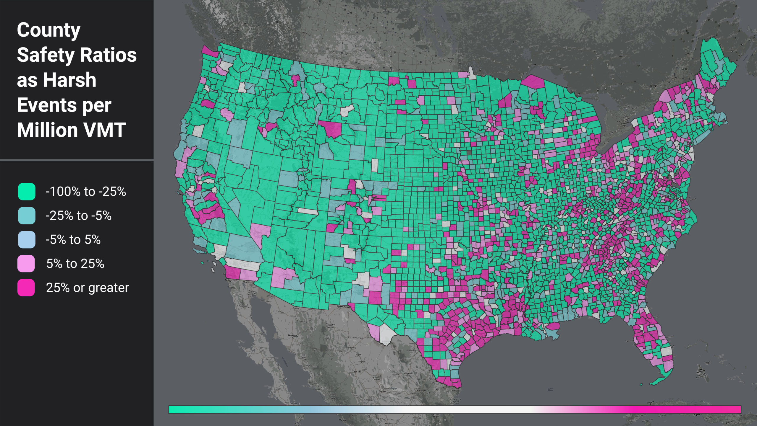
If one area has more harsh events just because they have more driving, that doesn’t really tell us much. But if an area has a lot of harsh events per mile travelled, then for any driver in that area, each mile driven is more dangerous than average. Figure 1 shows a heatmap of counties by their harsh events per million VMT (HE per VMT) ratio.
We compare each county’s HE per VMT to the nationwide average (29.36). The counties in teal color have a lower HE per VMT than the US average, and those that are magenta have higher.
Figure 1: National heatmap of U.S. counties as measured by a ratio of harsh events (HE) per million VMT.
When we filter for the counties with higher-than-average HE per VMT, we see that certain regional patterns emerge. In Figure 1, areas around the Gulf Coast, the Appalachian region, and coastal/border counties light up. This pattern suggests further analysis into local factors such as topography, road curvature, percentage truck and pedestrian activity, and more to help us understand why these counties have such high HE per VMT ratios.
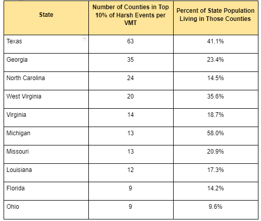
We also see that the top counties are confined to certain states. In fact, 13 states do not have a single county in the top 10%. For states with counties in the top 10%, some show up far more often than others. For example, 58% of Michigan’s population lives in counties with high rates of harsh braking events, while only 10% of Ohio’s population lives in similar high-risk counties.
Table 1: Top Counties by HE per VMT and Population Distributions
Calculating Population’s Effect
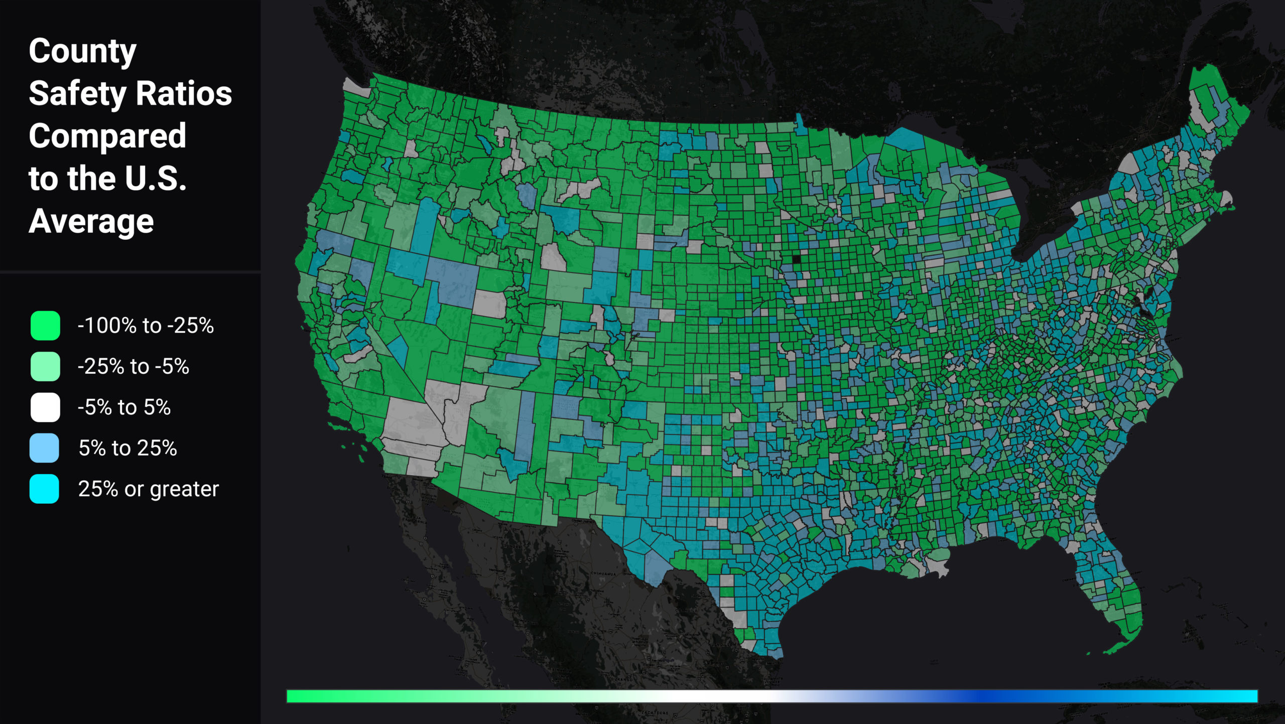
We wanted to assess if population was the real driver of a county’s higher-than-average HE per VMT, so we also analyzed harsh events per capita (HE per capita). We looked at each county’s HE per capita relative to the U.S. average (0.3), illustrated in Figure 2. Counties in green have lower than average HE per capita, while counties in blue have higher than average HE per capita.
Figure 2: Heatmap of U.S. counties by harsh event (HE) per capita, relative to the U.S. average (0.3). Green counties have lower-than-average ratios, while blue counties’ averages are higher.
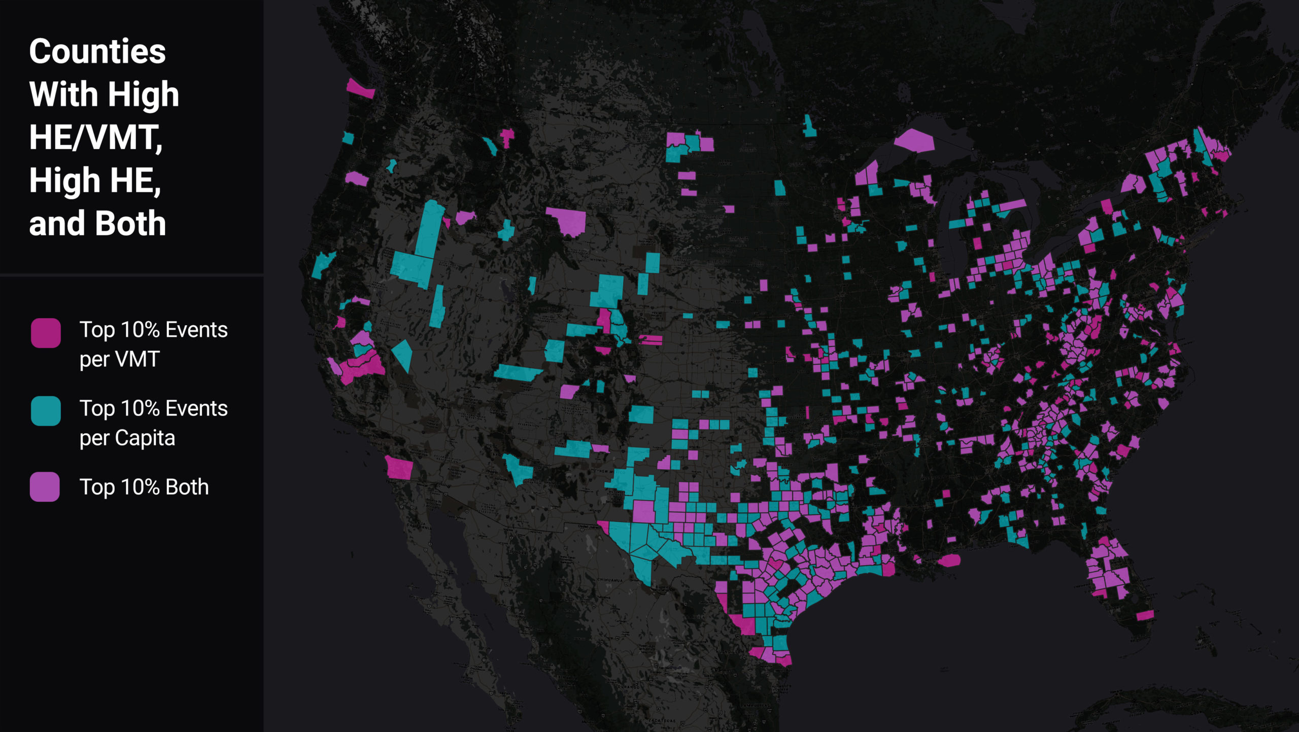
We found a majority of counties that have high HE per VMT also have high VMT per capita. However, there are 127 counties which are in the top 10% of harsh braking events per VMT and not per capita, indicating areas of especially high risk for locals. As shown in the map below, many of these counties are rural and situated along major highways. Thus these counties’ population may be bearing the safety impact of “cut through” drivers.
Figure 3: Heatmap of U.S. counties comparing those with high HE/VMT (magenta) to those with high HE per capita (aqua), and high in both categories (light purple).
Conclusion
We see here that integration of multiple data sources can better inform strategic safety planning and decision-making. Like crash and injury rates, which normalize crashes relative to the amount of travel, combining near-miss data with VMT and population data (and more) can help safety professionals proactively zero in on where crashes are most likely to happen, and implement appropriate safety measures. This approach is another data point, and another tool in the toolbox, for making progress toward zero deaths.Summarized from “Private Versus Shared, Automated Electric Vehicles for U.S. Personal Mobility: Energy Use, Greenhouse Gas Emissions, Grid Integration, and Cost Impact” by Colin J. R. Sheppard, Alan T. Jenn, Jeffery B. Greenblatt, Gordon S. Bauer, and Brian F. Gerke, Environmental Science & Technology 55, no. 5 (March 2, 2021): 3229–39.
Zero in on the Best Corridors for Bike Safety

Zero in on the Best Corridors for Bike Safety
New York City has a reputation for being a dangerous city for cycling, but transportation planners are attacking the issue. The city has taken on the Vision Zero challenge, a bold initiative intended to end all traffic deaths and serious injuries by 2024.
But are NYC planners — or any city’s planners — targeting high-exposure areas? Our new research report, Bike Safety Shift: Top 10 Riskiest States, leverages StreetLight’s Bicycle Metric to examine bicycling safety in a more granular way. Here we summarize one city’s analysis as an example for cities and states everywhere, so planners can invest wisely in bicycle safety through infrastructure planning that has the most impact.
High Bike Activity or Crashes May Not Equal High Risk
Traditional wisdom for any city might say to prioritize bike safety efforts in the densest areas where cyclists ride more. Or planners might choose to focus where more fatal crashes happen. In New York, most bike travel (and fatalities) happen in Lower Manhattan and central Brooklyn.
But when we capture the number of bike trips on all corridors across the boroughs, and then compare that to the number of crashes (not just fatalities), we find that exposure is actually higher elsewhere in NYC.
Planners have relied on incomplete statistics to calculate exposure because that’s been the best data that could be captured with sensors, surveys, and police reports. But focusing efforts based on population density or number of fatalities may not return the most significant bike safety results.
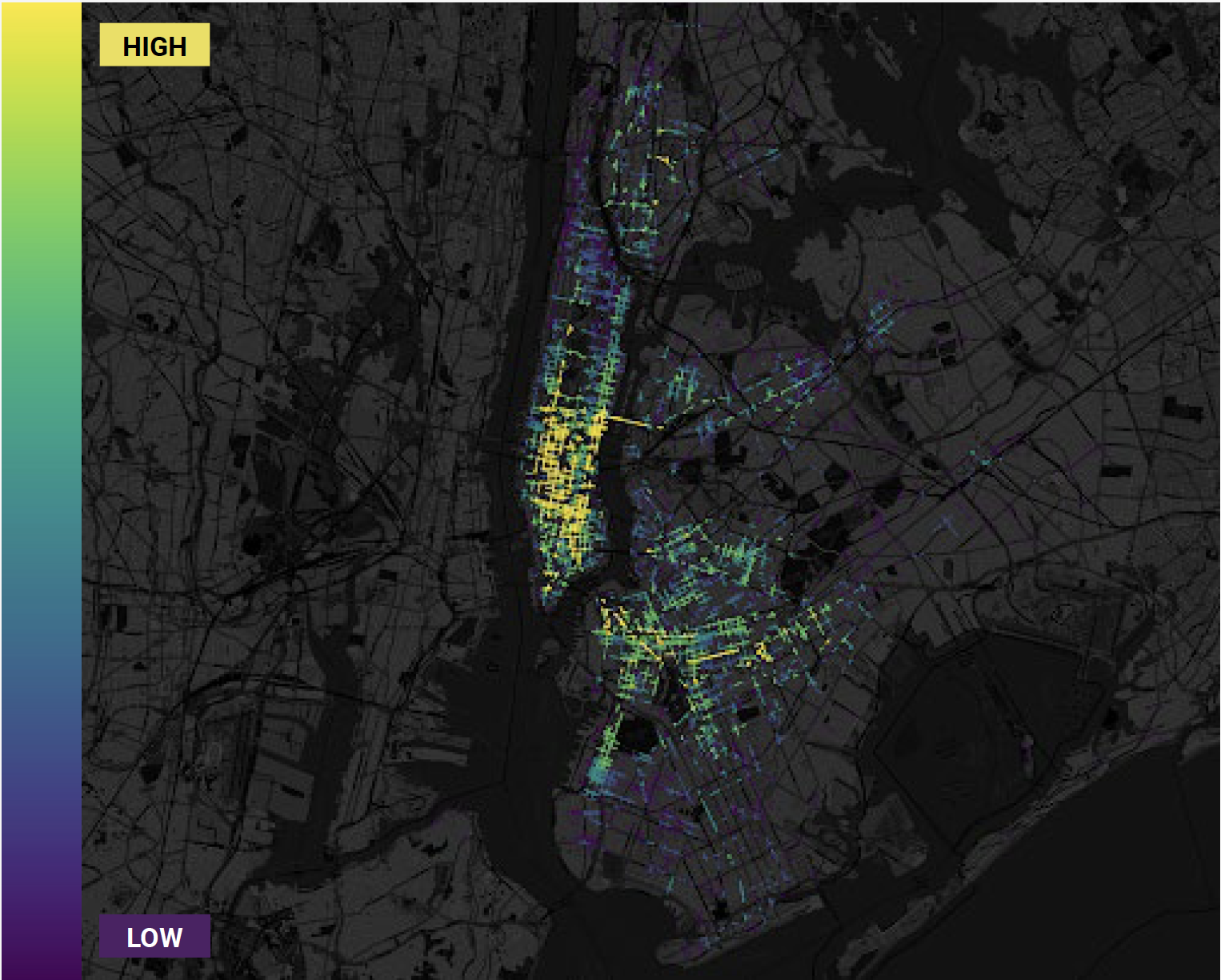
Figure 1: Heatmap of number of bike trips in New York City, 2018 and 2019.
Our analysis focused on cycling-centric data by using a unique process. We plotted all 4,127 NYC bicycle incidents on our map, and color-coded locations based on how many bike trips passed by those crash points. In this way we accounted for just the bike riders instead of the entire population.
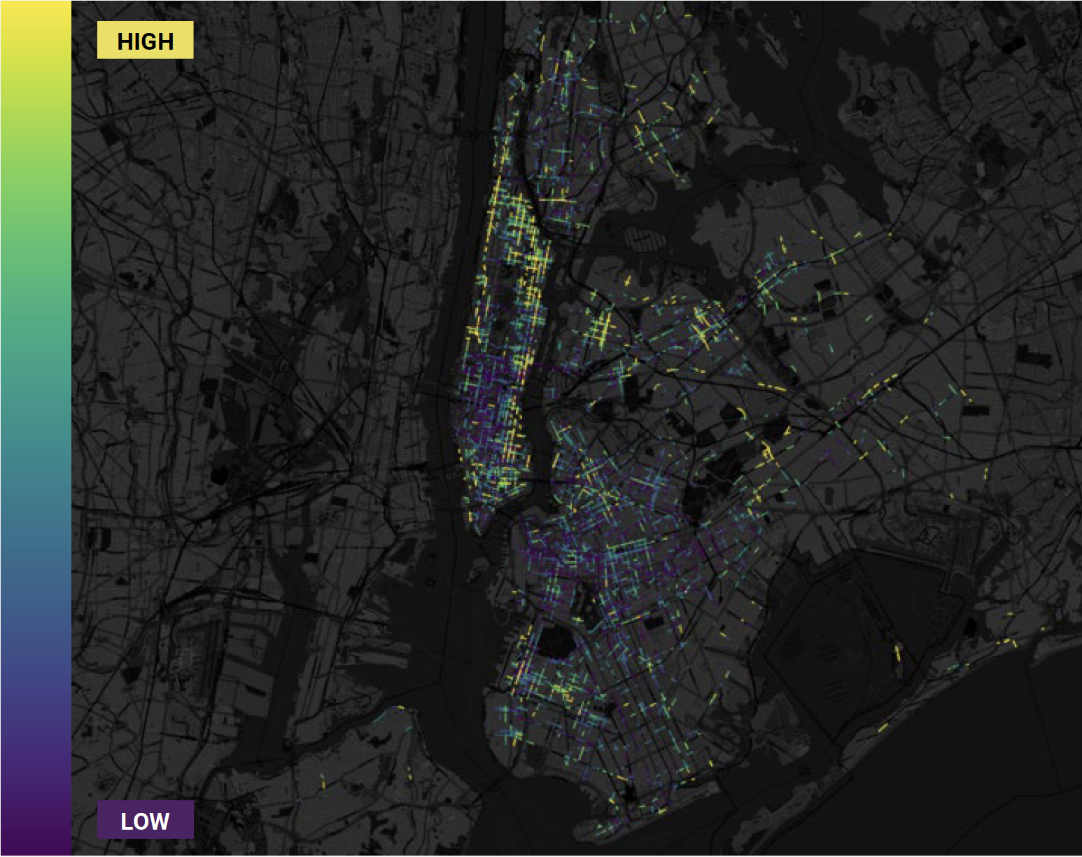
Figure 2: Heatmap of bike exposure areas, calculated by comparing bike crashes to number of bike trips.
When we plotted the comparison of bike crashes to bike trips, high-density cores in Midtown Manhattan and central Brooklyn stand out as low-risk areas. By contrast, Harlem and the Lower East Side light up with several high-risk bicycling corridors.
Traditional models may under- or over-inflate bicycling danger based on overall population numbers. StreetLight’s data can zero in on the real experiences of cyclists.
The Human Touch: Data Interpretation
StreetLight’s bike safety study reveals a lot about bike safety in NYC, but the data only goes so far. Data offers the “what” of planning, while the touch of an expert delves into the “why.” Planners have local intelligence to combine with the data for key insights.
For example, do some corridors have more cohesive bike infrastructure than others? Maybe bike lanes in some corridors have poor markings, or even lanes that start in one block and abruptly end a few blocks later.
Automobile speeds and volumes may shift dramatically from block to block. Or maybe a nearby school indicates more children riding and walking. It takes the critical eye of a city planner with expertise in their own city to bring data to life.
Even in large-scale projects, resources are finite. Data plus local expertise can optimize safety projects, making the reach for zero fatalities all the more possible.Summarized from “Private Versus Shared, Automated Electric Vehicles for U.S. Personal Mobility: Energy Use, Greenhouse Gas Emissions, Grid Integration, and Cost Impact” by Colin J. R. Sheppard, Alan T. Jenn, Jeffery B. Greenblatt, Gordon S. Bauer, and Brian F. Gerke, Environmental Science & Technology 55, no. 5 (March 2, 2021): 3229–39.
Orlando Transportation Analysis: Where Pedestrian Risk Is Highest

Orlando Transportation Analysis: Where Pedestrian Risk Is Highest
Smart Growth America recently rated Orlando the most dangerous transportation city in the U.S. for pedestrians for the second consecutive year. The metro area saw 740 fatalities between 2010 and 2019, or about 74 each year. Other Florida metro areas listed in the Top 10 included Tampa, Daytona Beach, Melbourne, Sarasota, and Jacksonville. It’s no surprise that Florida’s state government has directed the Florida Department of Transportation to adopt a Complete Streets policy.
In fact, pedestrian deaths across the entire United States have been rising for the past decade, according to SGA’s annual report, Dangerous By Design 2021. Disturbingly, fatalities were up as much as 24% in 2020, even though vehicle travel fell significantly. While tracking crashes is important for building effective safety initiatives, what’s even more important is layering in more data to identify and prioritize the riskiest areas.
In our latest eBook, Walk This Way: New Data for Pedestrian Safety, we decided to dig into a sample transportation analysis in Orlando to see what the crash data plus additional analytics could reveal.
A Tale of Two Zones
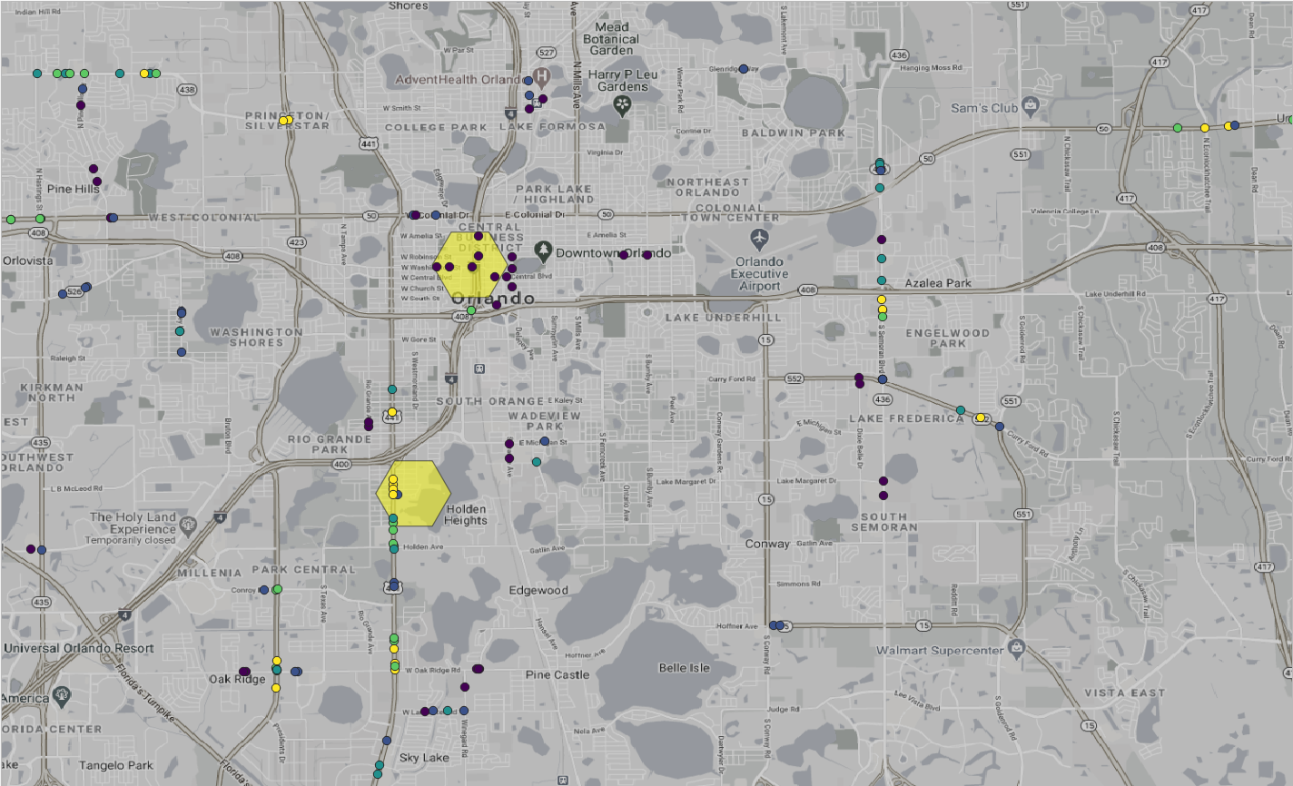
We divided the Orlando metro area into one-kilometer hexagons and plotted the locations of crashes and the level of pedestrian activity in each section. We chose two zones with similar crash volume: downtown Orlando with six fatal pedestrian crashes and a neighborhood called Holden Heights with seven.
Figure 1: Florida’s Department of Transportation data shows similar numbers of crashes in Orlando’s downtown area (top) and Holden Heights (bottom).
On the surface, one would think the two areas would need equal attention. Or perhaps downtown would need more, because there is more pedestrian activity there.
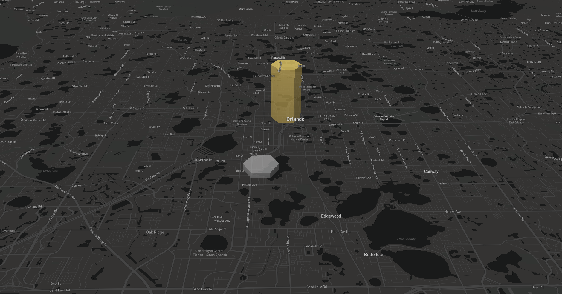
We found the opposite to be true. The fact that there are 15x more pedestrian activity downtown than Holden Heights, but both had similar crash numbers, actually makes downtown safer. Pedestrians are 19 times more likely to be killed while walking in Holden Heights than downtown. This finding is particularly noteworthy, given that we also saw big increases in pedestrian travel over the past year.
Figure 2: Orlando’s downtown (yellow) has 15x more pedestrian trip starts than the same-sized zone in nearby Holden Heights.
Crash data alone doesn’t capture the fact that pedestrian activity can differ significantly by neighborhood, and that activity fluctuated a lot in 2020. For example, downtown activity in Orlando stayed relatively constant from 2019 to 2020, but in some outer neighborhoods, it rose or fell by as much as 100% (download the full report to see the data).
Imagine the challenge if a high-risk neighborhood like Holden Heights sees a doubling in pedestrian trips.
Enhanced Metrics Expand the Safety Story
Pedestrian activity can be quite volatile from year to year, and walking activity in the city center doesn’t correlate with walking in the suburbs. Modeling based on old data won’t capture these changes. Combine those facts with the universal rising rates of pedestrian deaths, and it’s clear that risk is growing.
The deeper analyses available with transportation analytics can inform crash data in meaningful ways. Make sure your team can find and prioritize safety infrastructure investments in the places that need the most attention. Summarized from “Private Versus Shared, Automated Electric Vehicles for U.S. Personal Mobility: Energy Use, Greenhouse Gas Emissions, Grid Integration, and Cost Impact” by Colin J. R. Sheppard, Alan T. Jenn, Jeffery B. Greenblatt, Gordon S. Bauer, and Brian F. Gerke, Environmental Science & Technology 55, no. 5 (March 2, 2021): 3229–39.
How to Plan a Safe Charity Bike Ride

How to Plan a Safe Charity Bike Ride
With bicycling on the increase across the country, organizers should be expecting record numbers of riders at upcoming charity rides. Many of these riders either will be new to cycling, or will have returned to it recently after a long hiatus. For inexperienced cyclists, sharing the road with fast-moving vehicles can be too terrifying to consider.
How can organizers identify potential high-risk areas, and choose routes where cyclists feel safe? I analyzed one of the country’s largest and most well-known charity rides to share ways that riders and organizers can plan routes and maximize safe event participation.
Ride Along With Pelotonia
Encompassing three days of events in Columbus, Ohio, Pelotonia began raising funds for cancer research in 2008. The 11 different bike rides available range from 25 to 100 miles each, providing options for all levels of rider skill and fitness.
Pelotonia makes extensive efforts to prepare cyclists for road riding by offering safety tips on the website and training ride leaders to coach and guide riders during the event.
There are many options that go into choosing a charity ride route, and while safety is one of the most important elements, no ride can remove cars entirely from the equation. As a special projects engineer at StreetLight Data, I have extensive transportation data at my fingertips. I was curious to see what our Metrics could reveal about vehicle traffic on Pelotonia’s routes.
Analyzing Vehicle Volume and Speed
I ride my bike to run errands, get exercise, and explore new places. I’m used to planning long routes, including a cross-country ride several years ago. Two of the most important factors I consider when planning a route are car volumes and speeds on the roads I’ll be riding.
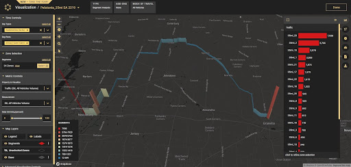
Many of Pelotonia’s rides share the same road segments. To analyze them, I downloaded the KML files for each of the routes and used GIS to combine and split them at regular intervals. I then uploaded them as line zones to our transportation analytics software platform, StreetLight InSight®.
I can calculate volumes and speeds in StreetLight Insight® by simply running a Segment Analysis on the 2019 event (2020 was cancelled due to COVID restrictions, and 2021 routes haven’t yet been announced). I used the platform’s default settings to analyze metrics by average day, weekday, and weekend day, and then further by general time of day. I’ll be looking specifically at average weekend day speed and Volume Metrics from 2019.
Counting Columbus’ Cars
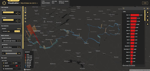
The shortest and longest routes for Pelotonia start in downtown Columbus. My visualization shows immediately that these are the higher-volume roads for vehicles, with vehicle volume decreasing the farther you get out of town. Some segments on South High Street see around 12,000 cars on the average weekend day.
Figure 1: Vehicle volume on the Pelotonia cycling routes.
There also appear to be a few half-mile segments where the bike route takes roads with 10,000 cars on the average weekend day – places for cyclists to be extra vigilant. One short segment (only about 1,500 feet) sees more than 16,000 vehicle trips on an average weekend day.
Seeing Where Vehicles Speed Up
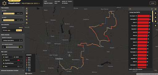
Vehicle traffic volumes decrease the farther away you ride from Columbus, but average speeds go up. The half-mile segments with about 10,000 vehicles on the average weekend day have speeds up to 35 mph. Some roads have a 50 mph average for speeds on weekend days, which means plenty of cars are driving even faster. And that 1,500-foot high-volume section averages speeds of 40 mph, which makes it definitely the most dangerous segment.
Figure 2: Vehicle speeds on the Pelotonia cycling routes.
This is something I’d want to consider when selecting a route – would I prefer roads with low traffic volume but high speeds, or the other way around? I personally favor low traffic, so I would opt for one of the routes that start outside of town. Although cars are traveling faster, I feel safer with fewer cars, and the ride is quieter and more enjoyable.
Which Routes Are Safer?
Those doing a century ride (100 miles) can make a route choice at around the halfway point. The Bennington Church route turns to the west and the Reynolds Road route to the east (one can also choose to ride only portions of these two routes).
In terms of traffic and speeds, these two options look fairly equivalent to me. Riders fit enough to take on a century are usually experienced in sharing the road with vehicles, and are likely to make their route choices based on other factors, such as amount of climbing, scenery, etc.
Figure 3: Vehicle volume on the “beginner” 35-mile Pelotonia route.
For beginners, there are two routes that Pelotonia recommends – the 25- and 35-mile routes. I studied these routes to learn more about what vehicle traffic the riders are likely to encounter.
The 25-mile option, although shorter, is the first 25 miles out of Columbus. It therefore shares the road with a higher volume of cars than other routes, but they are traveling at slower speeds.
On the other hand, the 35-miler is a completely different route. The ride utilizes lower-volume roads, and also takes place on a Sunday. A Segment Analysis on this route shows very low weekend traffic and speeds mostly in the 30s and 40s. Pelotonia also mentions that the 35-mile route has less climbing.
Overall, it looks like the 35-mile option may be the safer route for beginning riders uncomfortable with sharing roads with vehicles. Less time on the roads doesn’t always mean less risk for cyclists.
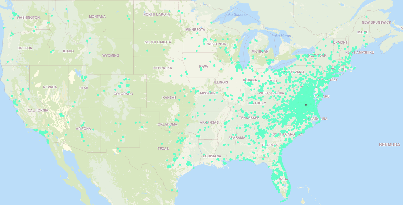
Figure 4: Visitors to Pocahontas State Park in 2018.
StreetLight doesn’t (yet) provide metrics directly comparing bicycle to vehicle traffic, but I tried a little workaround just because I was curious. I pulled the average-day bicycle traffic at PSP for four months in 2017 and 2018. When I compared those numbers to the calibrated personal trips during the same time period, bicycle trips were 11% of the total park traffic. Again, this isn’t a statistically valid finding for Virginia mountain biking numbers, it was just me playing around in the platform for directional, not definitive, data.
When to Visit Pocahontas State Park
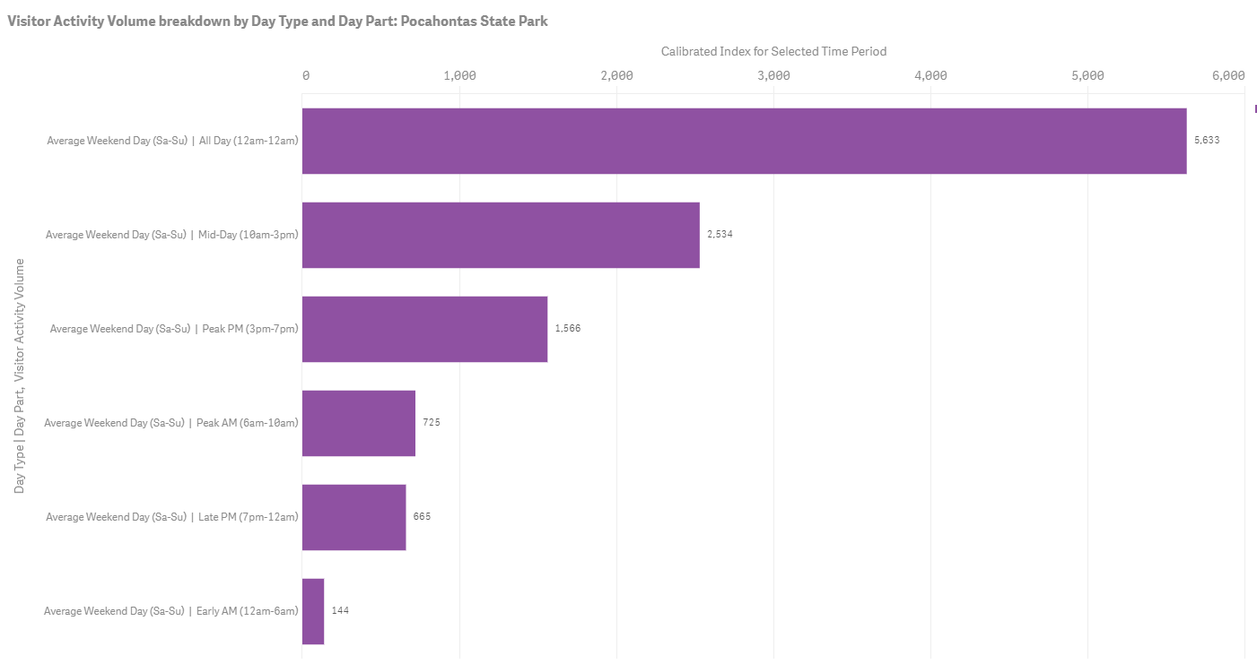
When I ride my mountain bike at PSP on the weekends, I’m usually trying to avoid peak times. So my final analysis of 2018 data helped me identify the best times to visit. I was happy to see that my preferred early morning riding time is a non-peak period on weekends. Not only am I avoiding the crowds, but I’m helping spread out visitorship to non-peak times, and leveling out this Virginia park’s demand curve.
Figure 5: Peak visit times to Pocahontas State Park on the average weekend day.
I live in downtown Richmond, a block away from about 20 miles of excellent single track. Before PSP added the new trails, I rode at home because I didn’t want to load my bike onto the bike rack and drive 30 minutes each way to PSP.
Now, I drive out there to ride almost every weekend — the new trails are that good. And clearly I’m not alone! StreetLight’s analysis confirmed my gut feel: Virginia’s Pocahontas State Park has indeed become a world-class mountain biking destination.
Less Traffic Means Faster — and Deadlier — Driving: Insights from Walk Bike Nashville’s Mobility Data for Safer Streets Project

Less Traffic Means Faster — and Deadlier — Driving: Insights from Walk Bike Nashville’s Mobility Data for Safer Streets Project
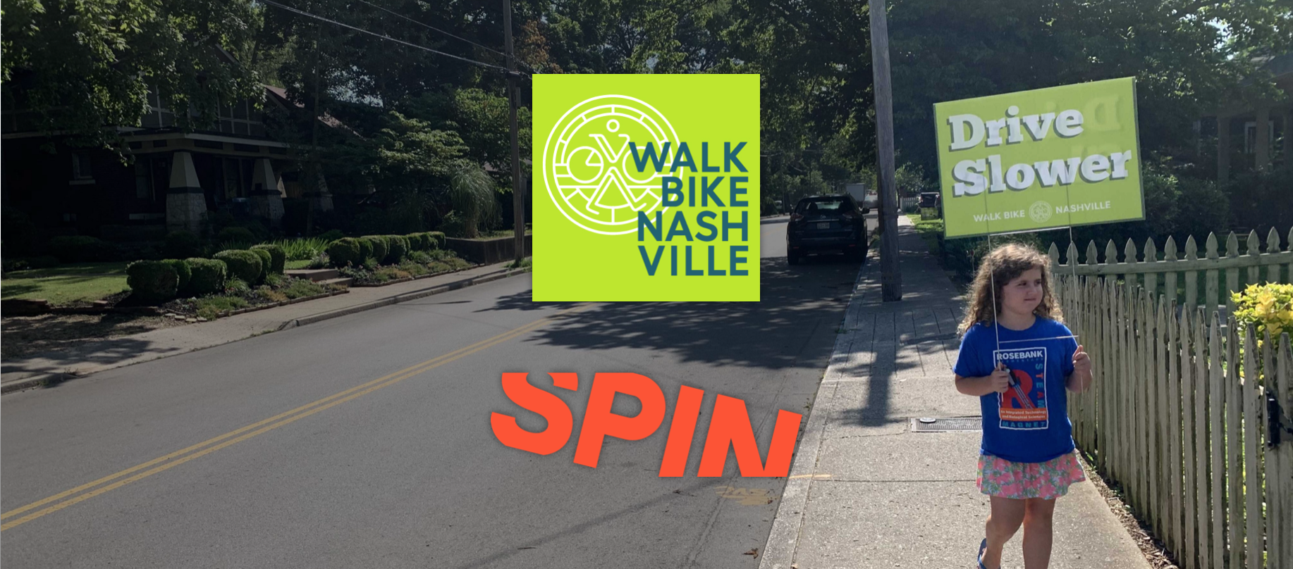
We asked Spin to share this guest blog about their latest analysis on the Safer Streets program in Nashville, TN, during the COVID-19 pandemic. Josh Johnson is a Public Policy Manager at Spin.
A few months ago Walk Bike Nashville (WBN) started hearing from residents across town that despite the reduction in overall traffic volumes as a result of the pandemic, people were seeing people drive at higher speeds in their neighborhoods. WBN decided to take a look at traffic volume and speeds, starting on Greenwood Ave in East Nashville.
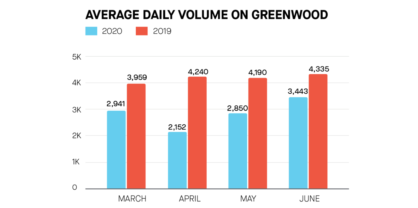
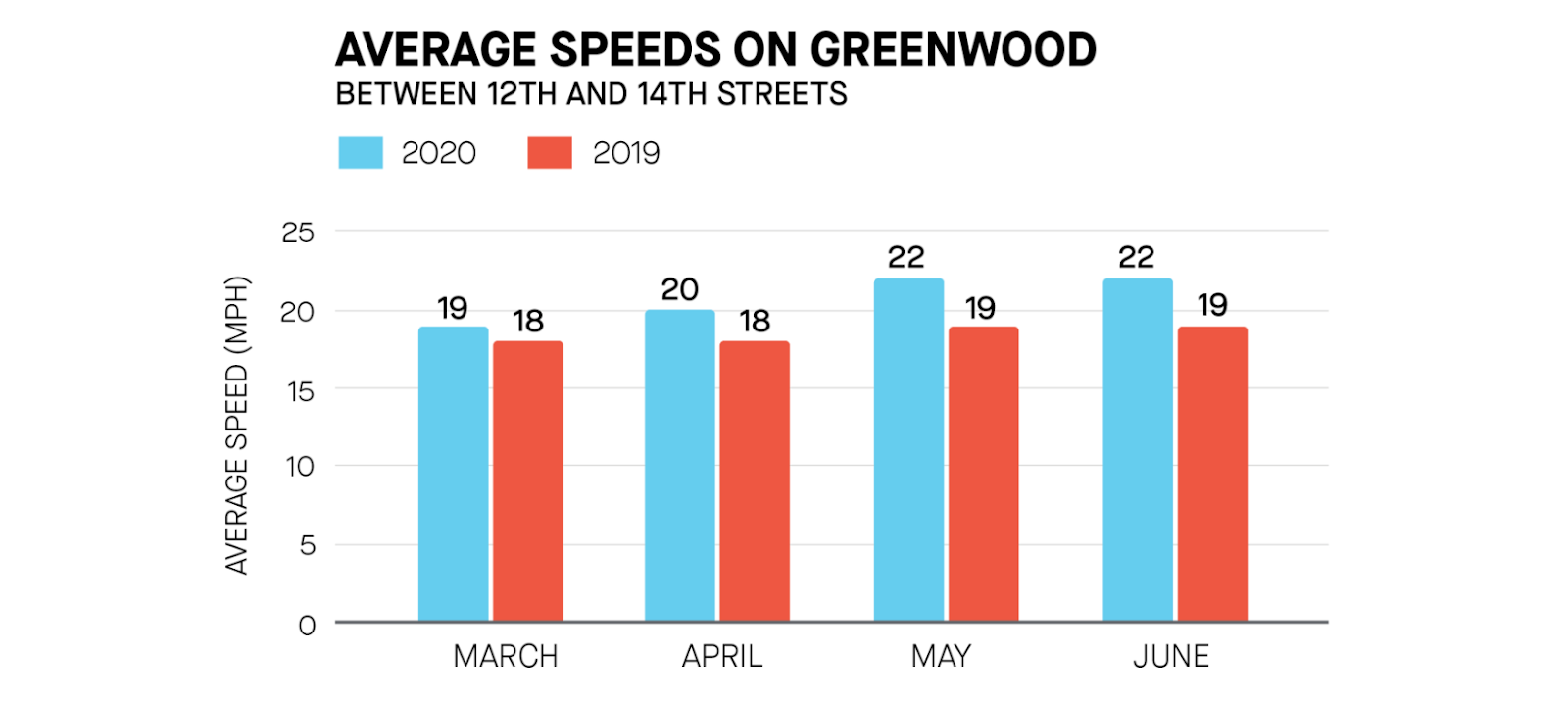
Using the StreetLight Data’s InSight platform, a transportation analytics and visualization tool provided through Spin’s Mobility Data for Safer Streets program, WBN performed an analysis of traffic volume and speed on Greenwood Ave, comparing the months of March through June of 2019 with the same period in 2020. This analysis validated residents’ concerns that despite an overall reduction in traffic this spring, average speeds were up. Even more concerning, the number of people driving over the speed limit was also up.
“The amount that speeding increased due to reduced traffic volume after the first wave of COVID-19 was surprising. It emphasizes the fact that our streets trigger this behavior, and that more work needs to be done to incorporate traffic calming and other infrastructure improvements in order to make streets safer for all users,” said Nora Kern, executive director of Walk Bike Nashville.
Here is more detail on what WBN found:
- During this spring (March — June 2020) total traffic volumes were down on Greenwood by between 20 to 50 percent compared to the same period in 2019. This makes sense, as many people are working from home and reducing their trips during the pandemic.
We asked Spin to share this guest blog about their latest analysis on the Safer Streets program in Nashville, TN, during the COVID-19 pandemic. Josh Johnson is a Public Policy Manager at Spin.
A few months ago Walk Bike Nashville (WBN) started hearing from residents across town that despite the reduction in overall traffic volumes as a result of the pandemic, people were seeing people drive at higher speeds in their neighborhoods. WBN decided to take a look at traffic volume and speeds, starting on Greenwood Ave in East Nashville.
Using the StreetLight InSight® platform, a transportation analytics and visualization tool provided through Spin’s Mobility Data for Safer Streets program, WBN performed an analysis of traffic volume and speed on Greenwood Ave, comparing the months of March through June of 2019 with the same period in 2020. This analysis validated residents’ concerns that despite an overall reduction in traffic this spring, average speeds were up. Even more concerning, the number of people driving over the speed limit was also up.
“The amount that speeding increased due to reduced traffic volume after the first wave of COVID-19 was surprising. It emphasizes the fact that our streets trigger this behavior, and that more work needs to be done to incorporate traffic calming and other infrastructure improvements in order to make streets safer for all users,” said Nora Kern, executive director of Walk Bike Nashville.
Here is more detail on what WBN found:
- During this spring (March — June 2020) total traffic volumes were down on Greenwood by between 20 to 50 percent compared to the same period in 2019. This makes sense, as many people are working from home and reducing their trips during the pandemic.
We asked Spin to share this guest blog about their latest analysis on the Safer Streets program in Nashville, TN, during the COVID-19 pandemic. Josh Johnson is a Public Policy Manager at Spin.
A few months ago Walk Bike Nashville (WBN) started hearing from residents across town that despite the reduction in overall traffic volumes as a result of the pandemic, people were seeing people drive at higher speeds in their neighborhoods. WBN decided to take a look at traffic volume and speeds, starting on Greenwood Ave in East Nashville.
Using StreetLight Data’s InSight platform, a transportation analytics and visualization tool provided through Spin’s Mobility Data for Safer Streets program, WBN performed an analysis of traffic volume and speed on Greenwood Ave, comparing the months of March through June of 2019 with the same period in 2020. This analysis validated residents’ concerns that despite an overall reduction in traffic this spring, average speeds were up. Even more concerning, the number of people driving over the speed limit was also up.
“The amount that speeding increased due to reduced traffic volume after the first wave of COVID-19 was surprising. It emphasizes the fact that our streets trigger this behavior, and that more work needs to be done to incorporate traffic calming and other infrastructure improvements in order to make streets safer for all users,” said Nora Kern, executive director of Walk Bike Nashville.
Here is more detail on what WBN found:
- During this spring (March — June 2020) total traffic volumes were down on Greenwood by between 20 to 50 percent compared to the same period in 2019. This makes sense, as many people are working from home and reducing their trips during the pandemic.
- However, despite the fact that fewer people were driving on Greenwood, the average speed of drivers had gone up. This confirms what the Greenwood neighbors were experiencing: people are driving faster down their street.
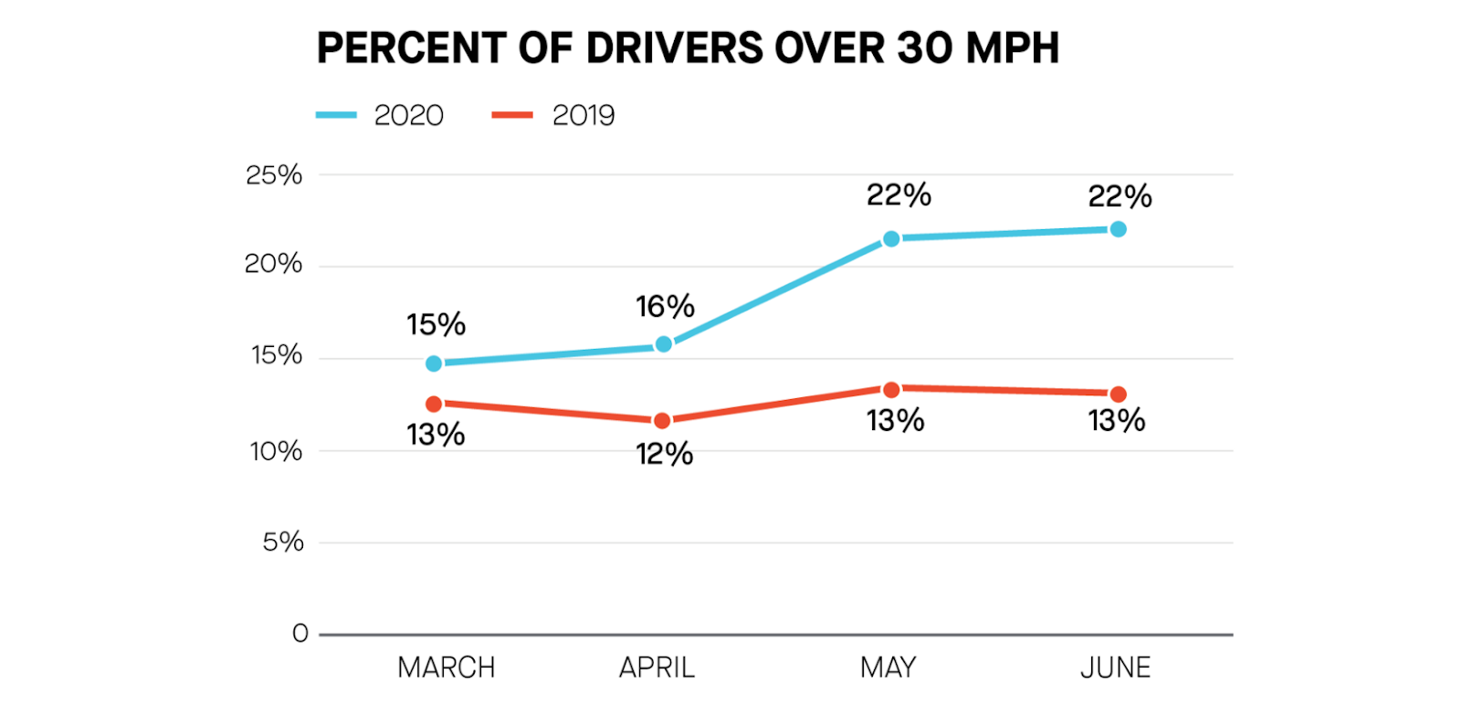
- Most troubling of all, the data obtained from StreetLight’s platform also confirmed that the percentage of vehicles driving over the speed limit (30 mph) has also risen in 2020 during the shutdown. In June, 22 percent of people going down the street were over the 30 mph speed limit.
Speeding is deadly; how do we stop it?
Organizations like Walk Bike Nashville have long been advocates for real solutions to this road safety crisis in our neighborhoods, that’s why Spin wanted to give them tools they can use to help save lives.
“We were very grateful to be able to validate the residents’ concerns and bring attention to this critical issue using the tools provided to us by our participation in the Mobility Data for Safer Streets program, and specifically the StreetLight InSight platform,” Kern said.
Speed is the number one contributing factor to car crashes, and the faster someone is driving, the more likely they are to kill someone in a crash. By far the most effective way to manage speeds is through infrastructure: traffic calming, narrow car lanes, wider sidewalks/bike lanes and other street-engineering techniques are essential in addressing traffic safety.
Walk Bike Nashville will continue to advocate for funding for traffic calming and for the city’s new Vision Zero program — these infrastructure investments are essential to keeping all Nashvillians safe when they are on the city’s streets. You can join them at their website: www.walkbikenashville.org.When our partner Boston Consulting Group used StreetLight’s VMT metrics to create a Trip Reduction Index, we were impressed by the methodology and the results. From calculating COVID’s impact on tax revenue to understanding how household income correlates with sheltering in place, the examples illustrate how transportation insights can be used to study the pandemic’s impact on residents, businesses, and budgets.
Just Where Are People Traveling Less?
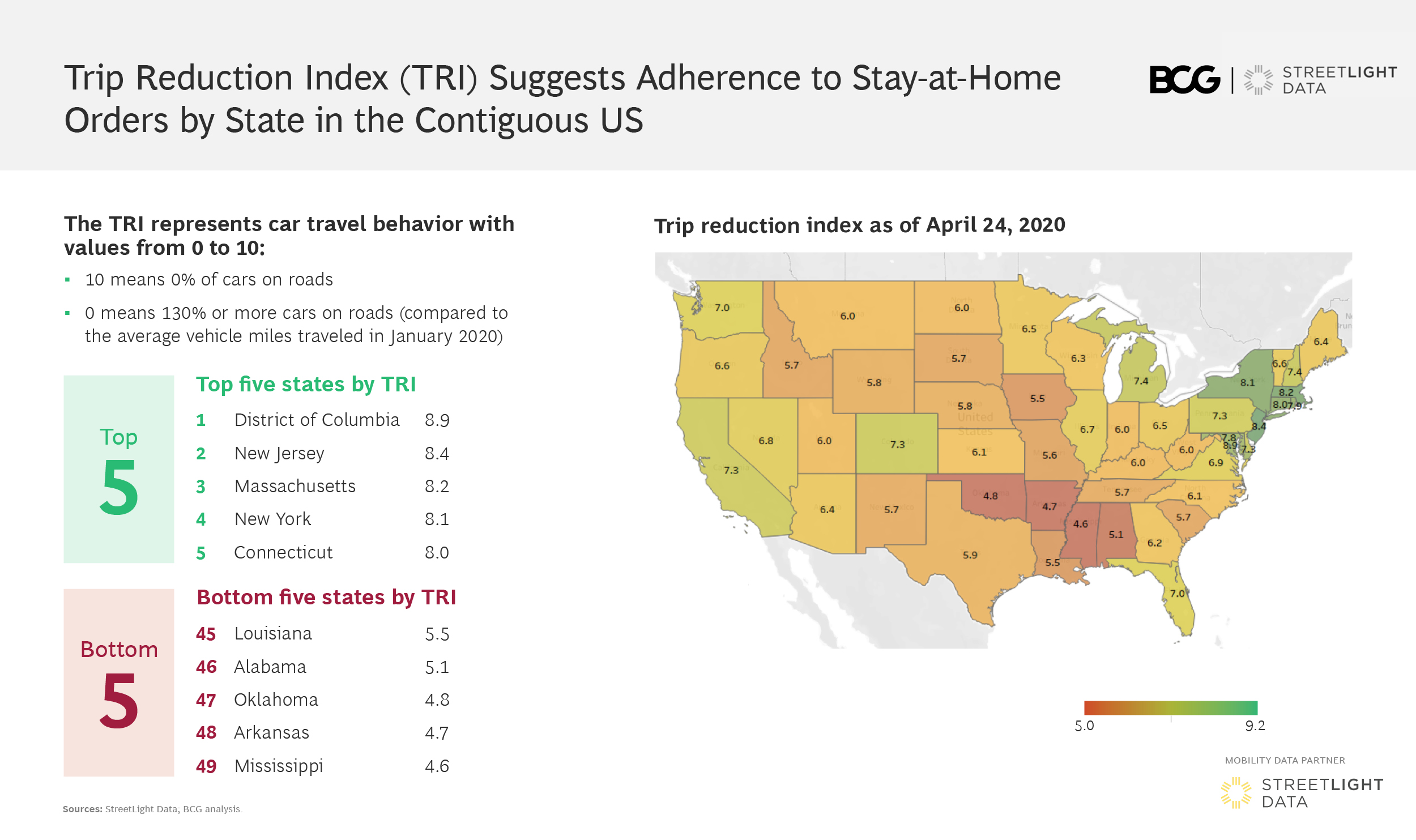
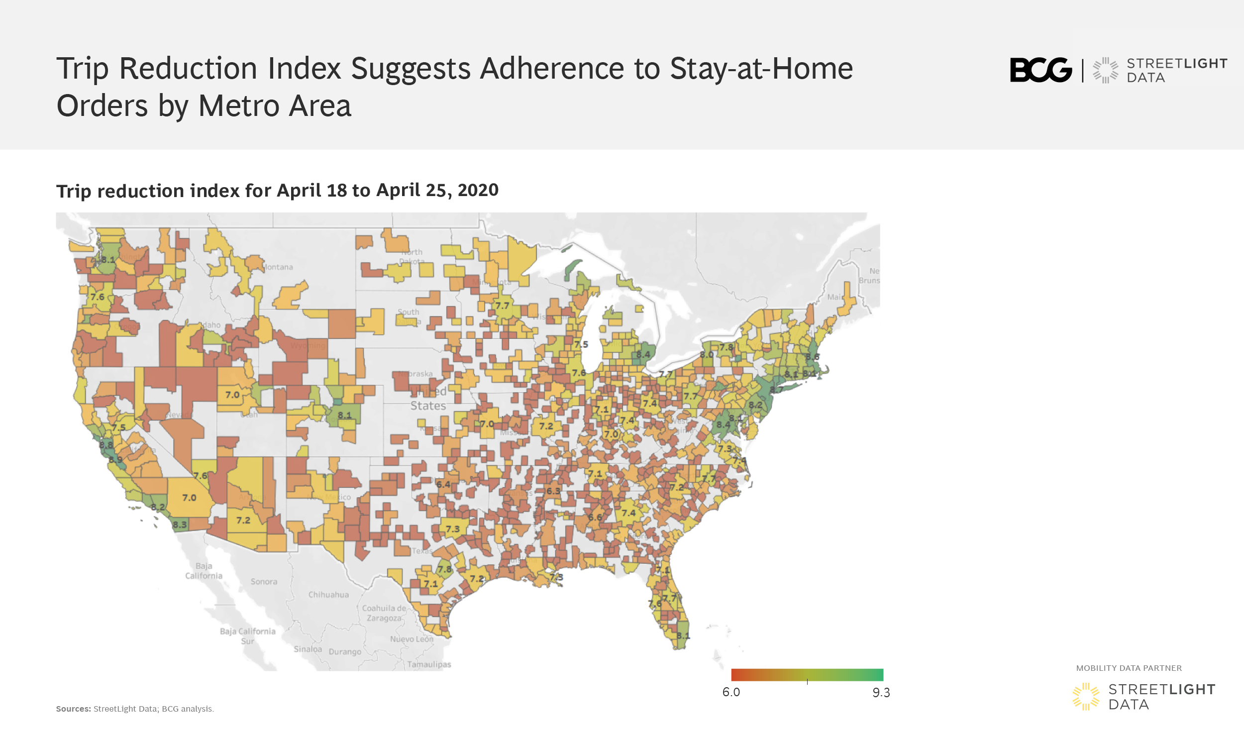
BCG and StreetLight have studied vehicle miles traveled (VMT) statistics from the beginning of March, as the COVID-19 pandemic took hold, and created a “Trip Reduction Index” that was used to measure adherence to stay-at-home policies in each state, county, and MSA. A few key insights stand out.
When our partner Boston Consulting Group used StreetLight’s VMT metrics to create a Trip Reduction Index, we were impressed by the methodology and the results. From calculating COVID’s impact on tax revenue to understanding how household income correlates with sheltering in place, the examples illustrate how transportation insights can be used to study the pandemic’s impact on residents, businesses, and budgets.
Just Where Are People Traveling Less?
BCG and StreetLight have studied vehicle miles traveled (VMT) statistics from the beginning of March, as the COVID-19 pandemic took hold, and created a “Trip Reduction Index” that was used to measure adherence to stay-at-home policies in each state, county, and MSA. A few key insights stand out.
First, we analyzed the U.S. overall to see trends state by state. As shown in the figure above, COVID-19 hotspots like the NY-NJ-CT “tri-state” area, Detroit, Chicago, and California have seen the highest level of trip reductions since March.
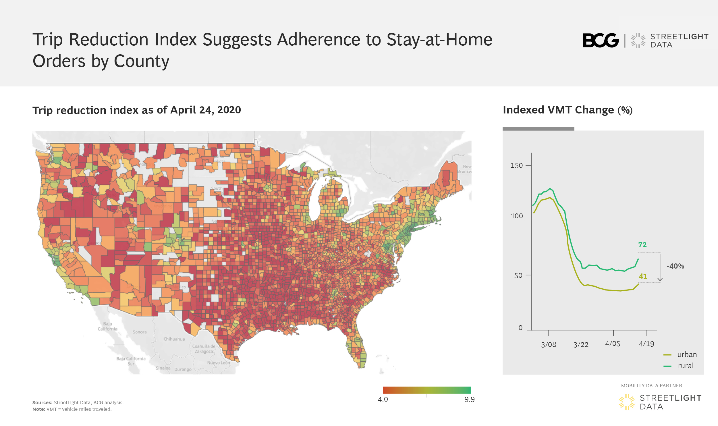
We then dug down to the county and metro-area level for a more localized analysis of VMT statistics. We found that population density is a key factor in adherence to stay-at-home orders. Urban counties saw on average a reduction in VMT by about 40% more than rural counties.
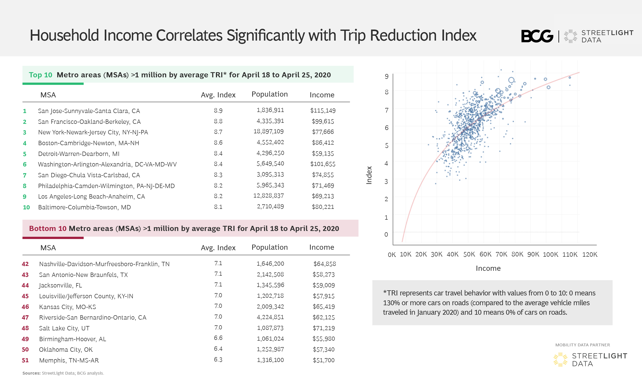
Using additional metrics from StreetLight InSight® we overlaid demographic data for an interesting finding. One of the key correlating factors for trip reductions turns out to be household income. This possibly results from the ability that higher-wage workers have to work from home, compared with those in positions requiring them to be at a physical location.
Impact on Freight and Commercial Travel
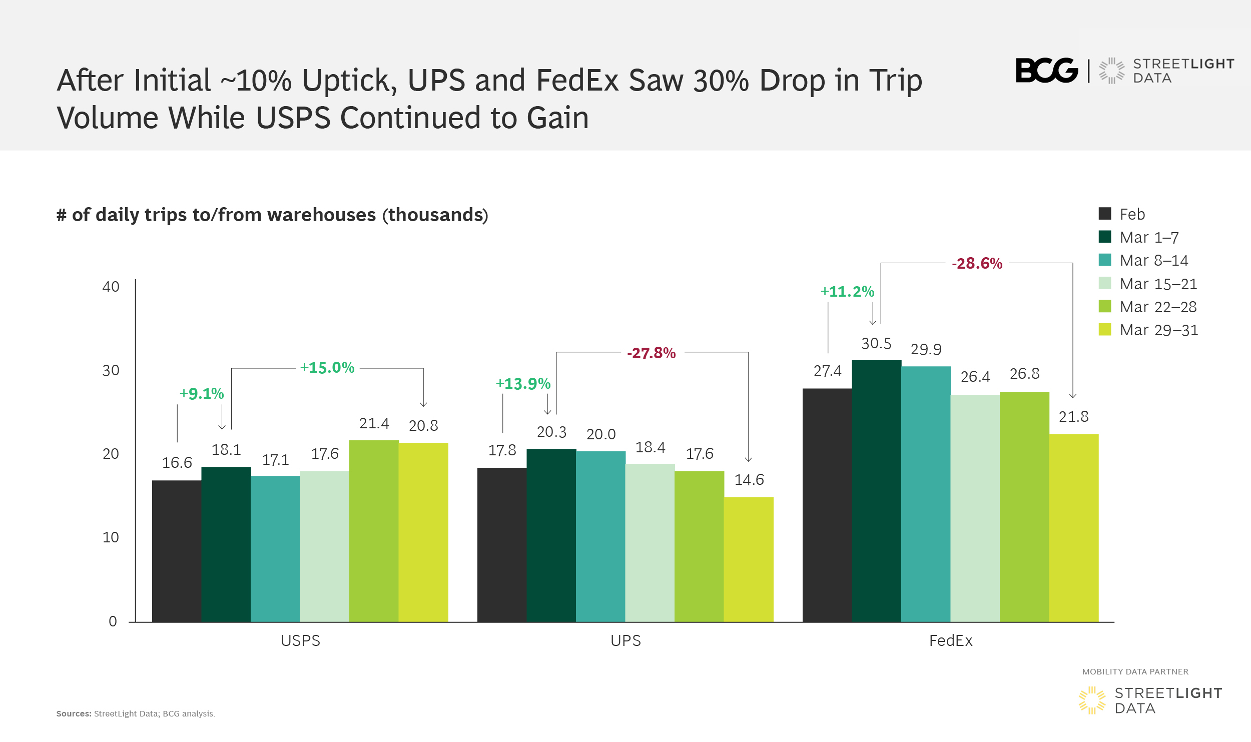
BCG and StreetLight studied VMT statistics from the perspective of commercial activity by studying trip volume at warehouses across the U.S. in March, as the COVID-19 pandemic took hold. We saw an initial surge in trip volume by approximately 10% across the top three players (the U.S. Postal Service, UPS and Fedex), driven by an uptick in online ordering at the beginning of lockdown measures. But over the long term, two of these top U.S. logistics players have experienced a 30% decline in trip volume.
The demand for food and consumables spiked, leading some CPGs, distributors, and retailers to run flat out for a few weeks while consumers scrambled to stock up on necessities. That surge has begun to slow down as consumers gain confidence that essentials would be available in the days ahead. Yet business has slowed among other parts of the retail value chain, as well as in manufacturing and non-essential retail segments, with stay-at-home orders significantly reducing customer visits.
Resulting Revenue Challenges
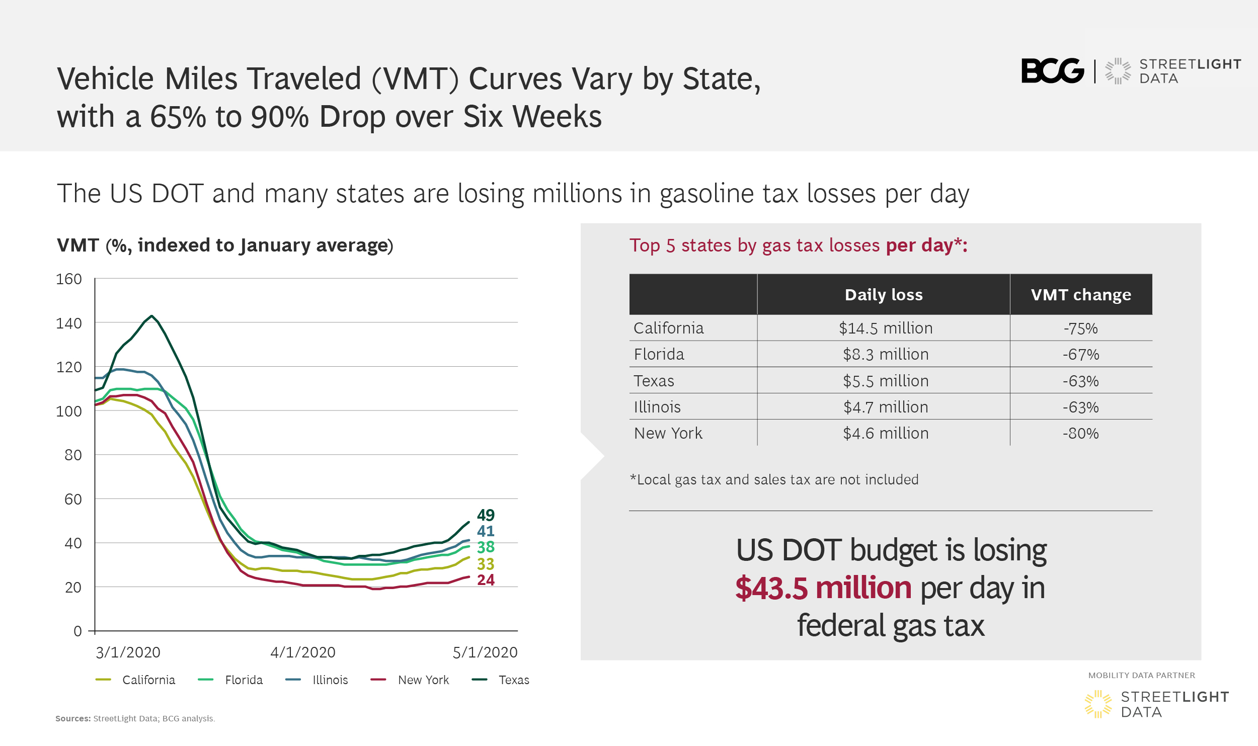
VMT statistics show a decline in each state by at least 65% since the beginning of March, when the COVID-19 pandemic took hold. States and areas with larger urban populations, such as DC and NY, saw their VMT drop 81 – 88%, the result of a combination of strict stay-at-home orders, reductions in commercial activity, and the availability of public transit as an alternative for essential workers.
This broad VMT decrease poses a significant revenue challenge for state budgets. It may ultimately accelerate the deployment of congestion pricing schemes and changes in tolling rates to recoup lost revenue, anticipating that VMT picks up as lockdown measures are relaxed and private vehicle usage rebounds faster than transit ridership.
California feels the largest impact, with an estimated daily $14.5 million loss in gas tax vs. what is expected at a VMT baseline. Florida, Texas, Illinois, and New York also face more than $4.5 million in daily losses, and the USDOT an additional $43.5 million.
We performed our analysis in StreetLight InSight® , the proprietary online platform for customers. But StreetLight is offering vehicle miles traveled statistics via their VMT Monitor — available for free during the pandemic. This resource is an invaluable starting point for understanding the impact of reduced travel on your region.
Augustin K. Wegscheider is a partner at Boston Consulting Group’s Automotive & Mobility Practice, where he manages the Center for Mobility Innovation in North America.
