
5 Inspirational Chord Diagrams: Data Visualization
Jump Ahead
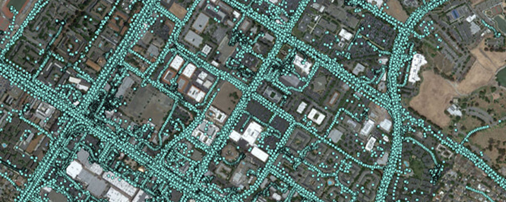
Data visualization is one of our favorite topics here at StreetLight Data. Since we first got started in 2011, our team has iterated on countless visualization options for our transportation analytics. Bar graphs and heat maps have long served as our trusty standbys – but these days, we’re thinking bigger. In our latest software release, we added two brand-new visualization types to StreetLight InSight®: the “heat matrix” and the “chord diagram.” You can join our upcoming training session to find out how these new visualizations work. In this blog article, I’ll share five fascinating chord diagrams to show you why they’re becoming my #1 go-to StreetLight InSight visualization. (New to StreetLight Data? StreetLight InSight is our on-demand transportation analytics platform.)
So, why get so excited about a new type of diagram? Well, chord diagrams are a particularly powerful tool for analyzing complex, interconnected data streams. Unlike travel pattern heat maps, our chord diagrams allow you to quickly comprehend the magnitude of different flows, and compare the flow of traffic between several areas at once. The thickness is more intuitive for comparing total trip volume and scale than colors on a heat map. As you’ll see in the examples that follow, chord diagrams are useful not only for transportation but for all types of data analysis.
Chord Diagram #1: Refugee Flows

See the data in action, register for our live demo
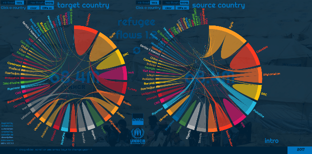
Register NowThis chord diagram visualizes the flow of refugees and internally displaced persons from 1994 to 2014. It was created by Dénes Csala, an assistant professor of engineering at Lancaster University. You can explore the data more deeply using an interactive web application he developed. (It’s actually similar to the way we set up interactivity between chord diagrams and heat maps in StreetLight InSight). Professor Csala also provides a helpful overview of the methodology behind chord diagrams in the introduction to his web application. This chord diagram is a great place to start if you’re not familiar with this visualization style.
The global and domestic flows of refugees and internally displaced persons can be overwhelming, but this chord diagram simplifies these interconnected relationships. That’s why we find the visualization so compelling. It made us think, “If we’re getting our information about the refugee crisis from newspaper headlines alone, we aren’t seeing the full picture.” By turning UNHCR data into chords that represent the volume of people moving from one country to another, Professor Csala shows us in one impactful image that the majority of the world’s refugees and internally displaced people have not left their home countries.
Chord Diagram #2: International Food Trade
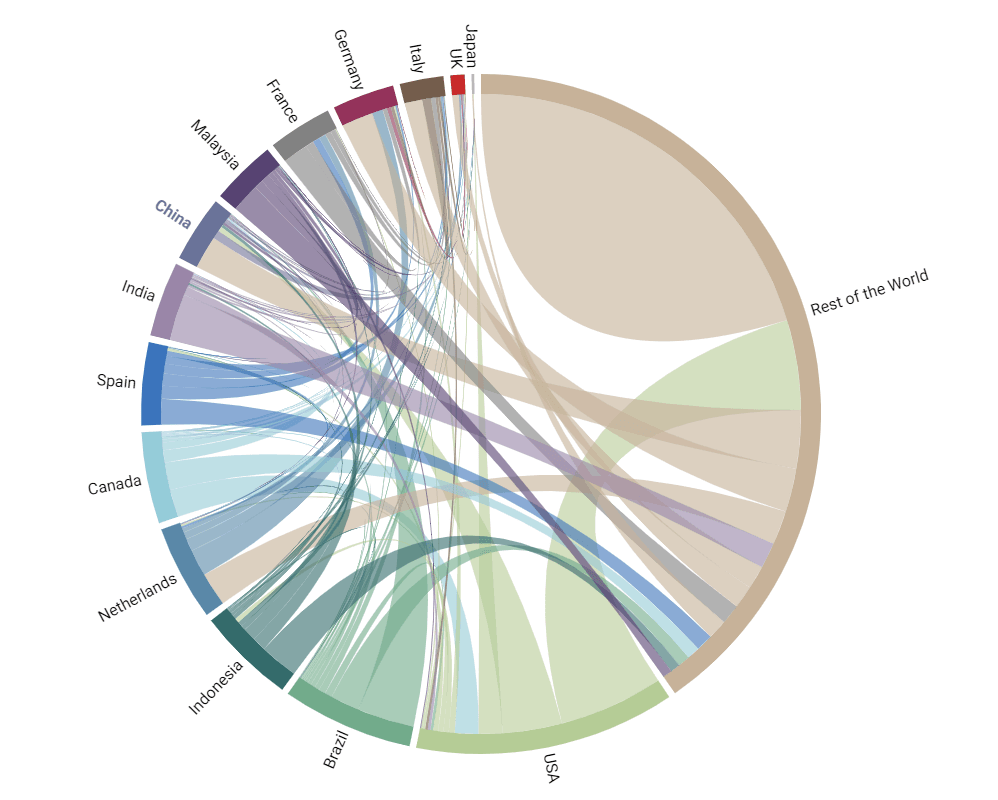
Product Trade between Origin and Destination Country by Year (HS6 REV. 1992)
This chord diagram was created by the China Power Project to illustrate how China, the world’s most populous country, feeds its 1.4 billion residents. We’re focusing on the trade in vegetables in 2014. (For a clickable, interactive version of this chord diagram, visit the China Power Project website.)
When we walk through the grocery store as consumers, we usually are not thinking about the origins of our vegetables, or where the produce on local farms will go after harvest. This diagram made us start thinking about those origin-destination relationships in empirical terms. The first thing we noticed is the substantial influence of the US in the international vegetable trade. Per this data set, the US is easily the largest exporter of vegetables globally. The US is also sending vegetables to every country in the diagram, with American farmers shipping more than 17.7BN USD worth of vegetables to China alone in 2014.
Americans may be known for exporting our fast food burger-eating culture, but the United States’ vegetables are clearly making an impact on the global good supply. The chord diagram also highlights how the world’s countries depend on international trading partners for their food supplies. We would love to see a version of this chord diagram that includes each country’s domestic food production data.
Chord Diagram #3: Consumer Loyalty to Cell Phone Brands
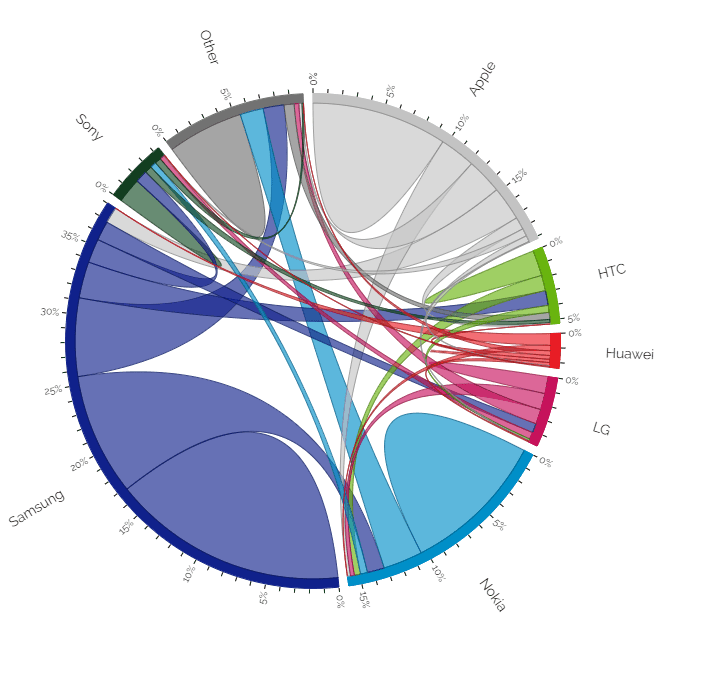
This chord diagram, made by Nadieh Bremer, visualizes consumer brand loyalty to cell phone manufacturers. Nadieh is a freelance data visualizer and artist. This particular chord diagram was created using data from a Deloitte survey of Dutch consumers about their current and former cell phone brands. You can view an interactive version of Nadieh’s diagram on her Visual Cinnamon website.
Mobile device data is core to our business at StreetLight Data. Plus, our team has more than its fair share of phone-loving technophiles, so this type of data is fascinating to us. We were amazed by the brand loyalty of Samsung phone owners, and also by the large share of consumers that have converted to Samsung devices from other phones in the Android operating system. Of course, the data behind this chord diagram is from 2014, before Google launched its own Pixel smartphone in 2016. We would definitely be interested in finding out how Google’s native device has changed the brand loyalty landscape for cell phones.
Chord Diagram #4: Traffic Flows in Baton Rouge, Louisiana
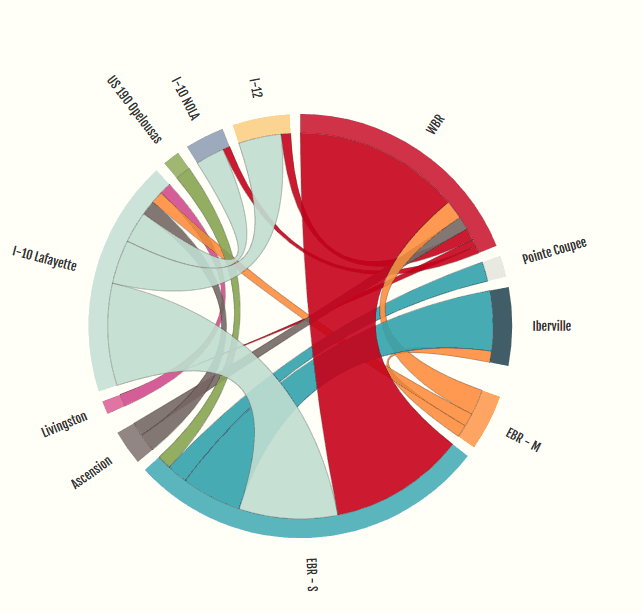
This is the visualization that inspired the StreetLight Data team to incorporate chord diagrams into the StreetLight InSight platform. It was created by Luis Alvergue, an engineer for Arcadis, one of our partners. The diagram shows the origins and destinations of drivers who use the I-10 Mississippi River bridge in Baton Rouge, Louisiana. It allows us to quickly determine that most of this bridge’s users are traveling from West Baton Rouge to East Baton Rouge – an important finding if you’re interested in developing an alternate route to reduce congestion on the bridge.
To learn more about this chord diagram and the data behind it, check out our guest blog post from Luis Alvergue and his colleague Thomas Montz here: Building Louisiana’s Bridges with Big Data.
Chord Diagram #5: Origins and Destinations of Commercial Truck Trips in New York City Neighborhoods
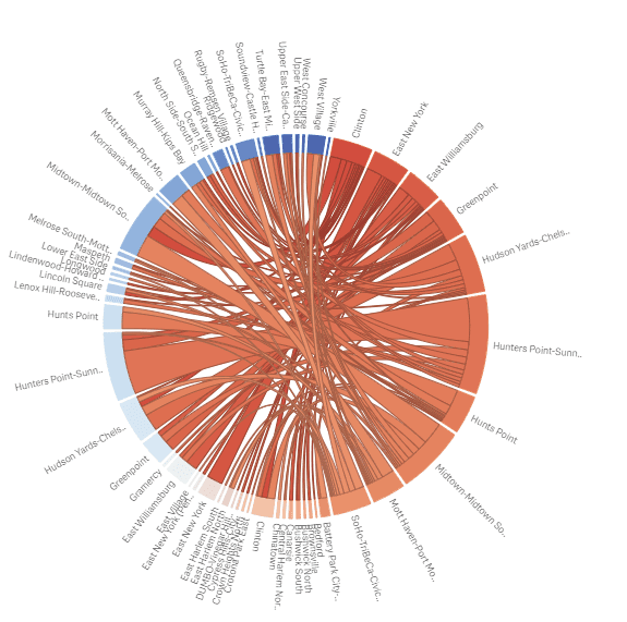
Finally, we want to show you at least one chord diagram from StreetLight InSight that we find fascinating. This visualization shows the origins and destinations of commercial truck trips in New York City during Peak AM hours by neighborhood. The base of the destinations are blue and the origins are orange.
We’re fascinated by this diagram because it lets us see all of the different origin-destination pairs at once and compare the trip volumes. Right off the bat, we can see that commercial trucks are likely to be causing problems in Midtown and Hunters Point – that’s one of the origin zones.

See the data in action, register for our live demo
Register NowReady to dive deeper and join the conversation?
Explore the resources listed above and don’t hesitate to reach out if you have any questions. We’re committed to fostering a collaborative community of transportation professionals dedicated to building a better future for our cities and communities.