Making Big Data Useful: StreetLight InSight® Home-Work Metrics, Visualizations, and More

Earlier this year, we integrated our new Location-Based Services data source into the StreetLight InSight® platform. Since then, we have steadily introduced Metrics and features built off that data that help our clients glean even more useful information from our platform. In this blog post, I’ll highlight the most exciting developments. (In case you need a refresher, StreetLight InSight is our easy-to-use cloud-based platform for transforming Massive Mobile Data into analytics that describe travel behavior.)
Understanding Activities: Visitor Home and Work Analysis
One of our most significant updates is a new project type, the “Visitor Home and Work Analysis” or “Visitor Analysis” for short. This project analyzes the aggregated home and work places of visitors to your selected locations, and the share of visitors who are tourists. The Metrics are derived from our Location-Based Services data source, which we recommend for describing “places and activities”. (In other words, Location-Based Services data are ideal for understanding where people stay in place. In contrast, our navigation-GPS data are better for describing people on the move.)
While some of our clients, particularly retailers, have always had access to similar information in the form of “Site Metrics”, this new project option goes much further. Importantly, these Metrics are more customizable now than they were in the past.
- Customizable Day Parts – Instead of relying on our default “day parts” you can define up to 25 time periods to study. For example, if you’re interested in the work locations of lunchtime visitors to a restaurant, you can zero in on the lunch hour that you define. It could be 12pm to 2pm, 12pm – 1pm, or 1pm – 2pm – and you could even study all three hour-long periods separately.
- Customizable Day Types – For example, you can count Friday as part of the “weekend,” or define “weekdays” as Tuesday, Wednesday, and Thursday. This can be particularly useful for analyzing tourist hotspots.
- Customizable Data Periods – You can choose the specific time periods of past years to analyze – down to the day. This opens up a ton of possibilities for studying trends over time, including seasonal analyses.

So, why introduce all this new functionality? Well, whether you’re a retailer, urban planner, or travel demand modeler, analyzing the home and work locations of the groups of people that visit locations at specific times of day is valuable.The large size and representativeness of our Location-Based Services data allows us to provide more granular insights for home and work locations than we could previously – while still protecting consumer privacy. Click here for more details on how we evaluated this data set.
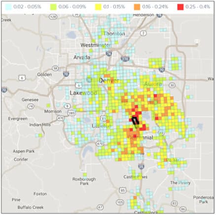
To give you a sense of how this Metric works, I’ve run the likely home locations of visitors to the Denver Tech Center from 6am – 10pm on weekdays (see below).
The Denver Tech Center is the Zone outlined in black above. The 1km grid represents the likely home locations (in aggregate) of Tech Center visitors who come to the building on weekdays between 6am and 10pm.
As you can see, the majority of visitors’ home locations are clustered near the Tech Center. However, there are also hotspots in Denver’s Lodo and Capitol Hill neighborhoods as well as in Aurora’s suburban Sable Ridge and Willow Park neighborhoods. Since the Denver Tech Center covers more than 850 acres and houses some of the largest employers in Denver, we expected to see this fairly large spread of home locations.
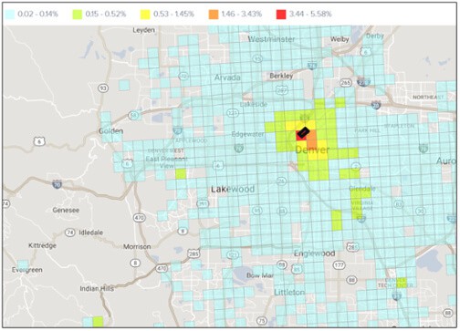
Now, let’s say we wanted to understand the share of Lodo that commute to the Denver Tech Center in particular. How does that compare to the other places these residents work? To find out, I ran a second “Home-Work” Analysis project, but focused on work locations instead of home locations. Here’s what that looks like:
The above heatmap shows the aggregate work locations for people that live in and nearby the Lodo neighborhood of Denver, which is outlined in black. The Denver Tech Center is one of the slightly more popular work locations.
As expected, our heat maps reveal that just under .02% of Lodo’s residents work at the Denver Tech Center, and that matches our home location Metrics for the Denver Tech Center.
Our Metrics reveal that work locations for the Lodo neighborhood are more concentrated in Denver’s downtown area. Even though the Tech Center is a major employment center, we can understand why folks in Lodo would rather work close to home in Denver. I-25, a key arterial for accessing the Tech Center, is home to some of the worst traffic in the US.
Retail clients who have run Metrics in our Site Analysis tool: Please contact support@streetlightata.com if you’re interested in porting your sites to the new Visitor Analysis option.
New Visualizations for Key Metrics
Since the very early days of StreetLight Data, I’ve heard from our clients that visualizations are critical, especially for communication with project stakeholders and the general public. With that in mind, we recently introduced visualizations for a few newer Metrics, and we tweaked our user interface to make building visualizations easier. The following Trip Attributes Metrics can now be visualized:
- Trip Length
- Trip Speed
- Trip Circuity
- Trip Duration
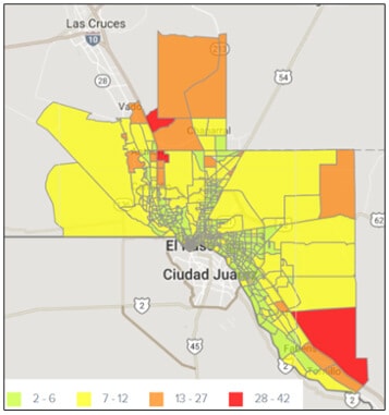
These visualizations can also make it easier for transportation engineers to communicate the differences in trip lengths generated by different locations. To illustrate how this works, I ran a “Zone Activity Analysis” project for all the transportation analysis zones (TAZs) in El Paso, Texas. This type of project runs Metrics for the relative volume and average length of trips that begin in, end in, or pass through a set of Zones.
This heat map shows the average length in miles of non-commercial trips originating in each TAZ during an average day, all day.
With this visualization, it’s easy to see that personal vehicle trips beginning in the three TAZs shaded in red are much longer, on average, than trips that begin in the other TAZs.
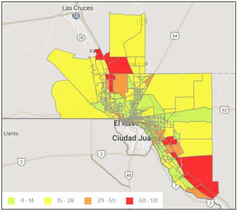
We could also evaluate how the results change for commercial truck trips, as shown below. Here, we’ve focused on trip length instead of trip duration. As expected, the lengths in miles of commercial truck trips are much longer than personal vehicle trips on average. However, there is considerable overlap between the TAZs that generate the longest personal and commercial trips.
This heat map shows the average length in miles of commercial truck trips originating in each TAZ during an average day, all day. The average commercial truck trip in this freight-heavy town is much longer than the average personal trip.
Next, I could re-run this same study as an Origin-Destination Matrix by Pre-set geography to automatically generate the top O-D pairs for each of these TAZs. This would allow me to determine exactly where long trips are going once they leave El Paso.


